
Smart Reports – WorkDo Dash SaaS Add-On Guide
Smart Reports Add-On for Dash SaaS with real-time business reporting and analytics.
Introduction
Smart Reports is a built-in reporting Add-On for Dash SaaS that helps you view important business data from one page. It includes ready-to-use reports, so you don’t need any technical skills or manual data work. Just choose a report, apply the filters you need, and the report is generated instantly. You can view the data on screen or export it when needed. The Add-On includes eight reports: Attendance Summary, Payroll Sheet, Leave Report, Sales Invoice, Purchase Invoice, Deal Pipeline, Product Stock, and Project Progress. This guide explains what each report shows, how to use the filters, and how to understand the data, views, and charts available in each report.
How To Install The Add-On?
To set up the Smart Reports Add-On, you can follow this link: Setup Add-On.
How to Use The Smart Reports Add-On?
Smart Reports
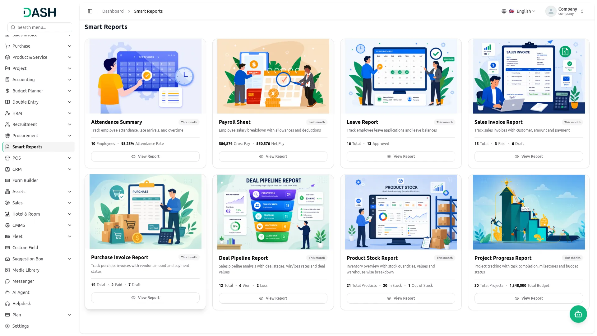
- The Smart Reports dashboard displays eight summary cards arranged across the screen, each showing the report name, a short description, and a live snapshot of its key metrics.
- The Attendance Summary card tracks employee attendance, late arrivals, and overtime, and shows the total number of employees and the current month’s attendance rate. The Payroll Sheet card covers employee salary breakdown with allowances and deductions, and displays last month’s gross pay and net pay.
- The Leave Report card tracks leave applications and leave balances, showing the total application count and how many are approved this month. The Sales Invoice Report card tracks sales invoices with customer, amount, and payment, showing total invoices along with the paid and draft counts for the current month.
- The Purchase Invoice Report card tracks purchase invoices with vendor, amount, and payment status, showing total invoices along with paid and draft counts. The Deal Pipeline Report card provides a sales pipeline analysis with deal stages and win/loss rates, showing total deals along with won and loss counts for this month.
- The Product Stock Report card provides an inventory overview with stock quantities, values, and warehouse-wise breakdown, showing total products alongside in-stock and out-of-stock counts.
- The Project Progress Report card tracks task completion, milestones, and budget status, showing the total projects and the total budget. Click View Report on any card to open that report.
Attendance Summary
- The Attendance Summary Report provides a complete day-by-day record of employee attendance for the selected date range. Set the date range; it defaults to the current month. Filter by All Employees and All Branches; select a branch first to enable the Department filter, then choose a department if needed, and filter by All Status. Click the search button to generate the report.
- The Export Excel and Export PDF buttons appear at the top right of the report page. Click Export Excel to download the data as a spreadsheet, or click Export PDF to download a printable version.
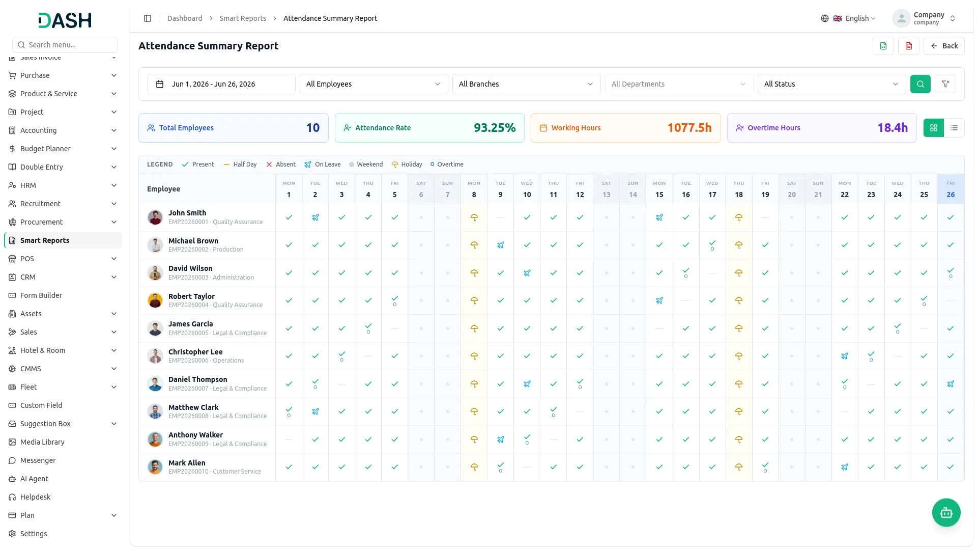
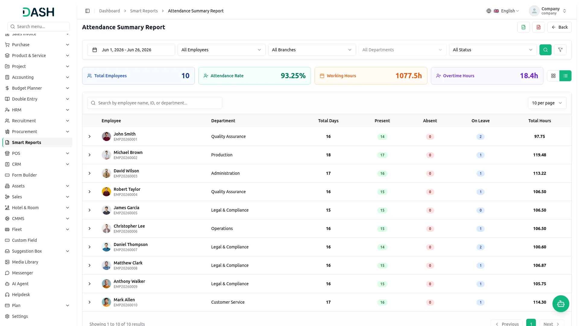
- The top summary bar displays four key metrics: Total Employees, Attendance Rate as a percentage, total Working Hours, and total Overtime Hours logged across all employees for the selected period.
- The report has two views, toggled using the view buttons on the right side of the summary bar. Calendar View is the default. It lays out attendance in a list where each column represents one day and each row represents one employee, showing their ID and department beneath their name.
- Each cell displays a status icon for that day: Present, Half Day, Absent, On Leave, Public Holiday, Weekend, or overtime beneath the icon when overtime was worked.
- Hover over any cell to see a pop-up showing clock-in time, clock-out time, total hours, overtime hours, and punctuality. Today’s column is highlighted in blue, and the employee name column stays fixed on the left as you scroll the calendar to the right. A legend at the top of the grid explains each icon.
- Table View groups all attendance records by employee, with one summary row per person showing the employee name, ID, department, total days in the period, present count, half-day count, absent count, on-leave count, and total hours worked.
- Click the arrow on any row to expand it and see the full day-by-day breakdown for that employee. Use the search bar at the top to find an employee by name, ID, or department
Payroll Sheet Report
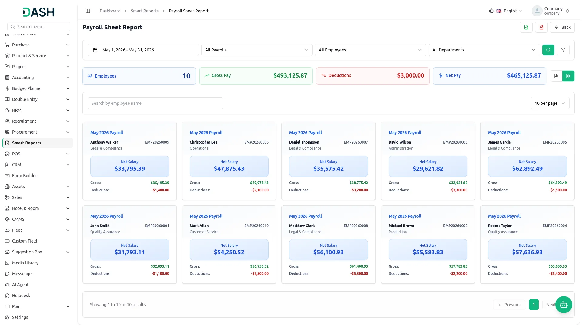
- The Payroll Sheet Report shows the salary breakdown for each employee, gross pay, deductions, and net pay for the selected payroll period. Set the date range, it defaults to the previous month, filter by All Payrolls, All Employees, and All Departments, and click the search button to generate the report.
- The Export Excel and Export PDF buttons appear at the top right of the report page. Click Export Excel to download the data as a spreadsheet, or click Export PDF to download a printable version.
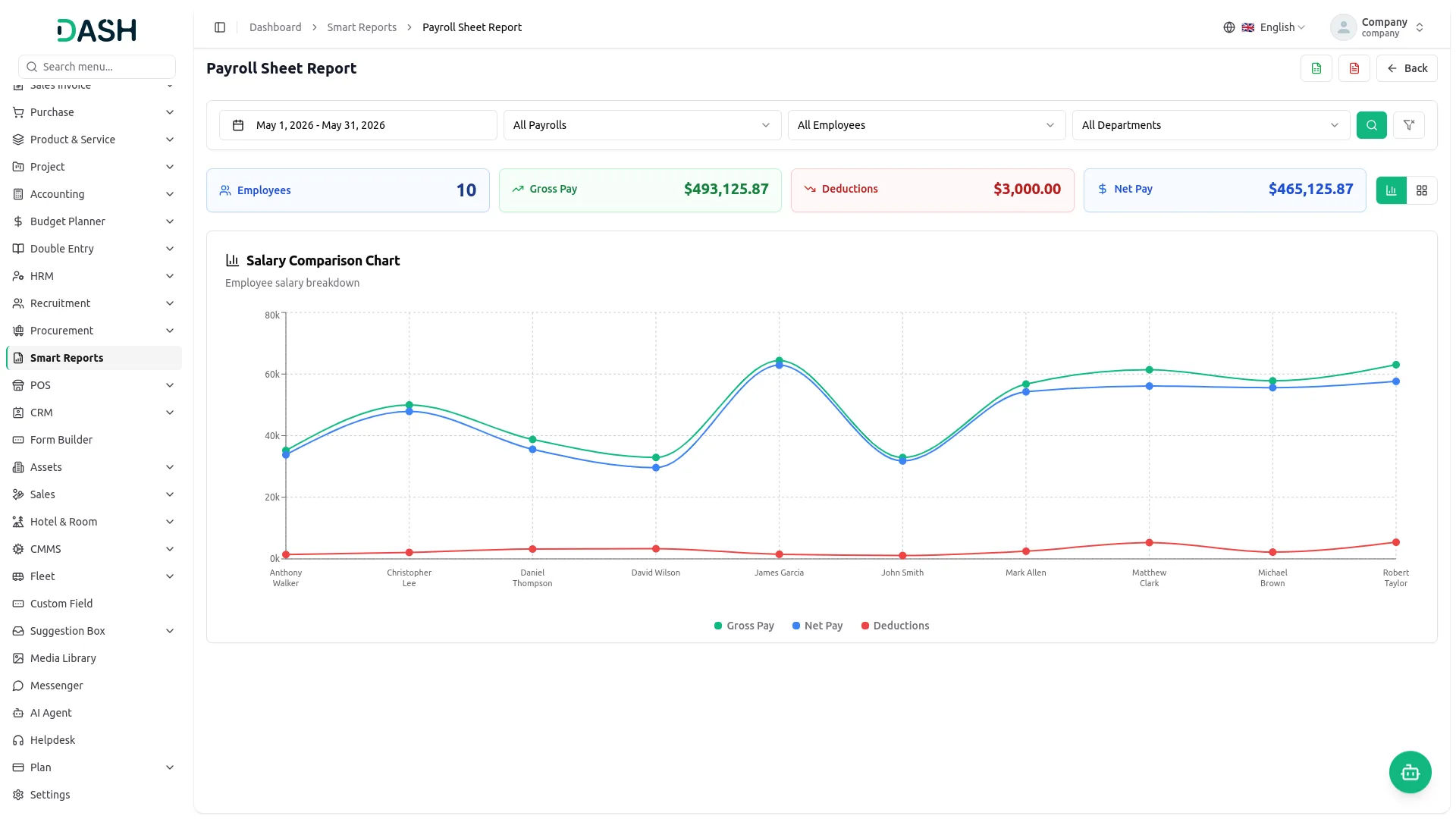
- The top summary bar displays four key figures: Employees total, total Gross Pay, total Deductions, and total Net Pay for the selected period.
- The report has two views, toggled using the icons on the right side of the summary bar. Chart View is the default. It displays a Salary Comparison Chart with three lines plotted across all employees for the selected period: Gross Pay, Net Pay, Deductions.
- Hover over any point on the chart to see a tooltip showing the employee’s name and exact figures for deductions, gross pay, and net pay. A color legend beneath the chart identifies each line. If there are many employees, the chart scrolls horizontally.
- Grid View displays each employee as an individual card showing the payroll period name, the employee name, ID, and department, the net salary as a large highlighted figure in the centre, and the gross pay and total deductions shown below it. Use the search bar to find employees by name.
Leave Report
- The Leave Report shows all leave applications submitted by employees, approved, pending, or rejected, for the selected period. Set the date range; it defaults to the current month. Filter by All Employees and All Branches; select a branch first to enable the Department filter; then choose a department if needed; and filter by All Leave Types and All Statuses. Click the search option to generate the report.
- The Export Excel and Export PDF buttons appear at the top right of the report page. Click Export Excel to download the data as a spreadsheet, or click Export PDF to download a printable version.
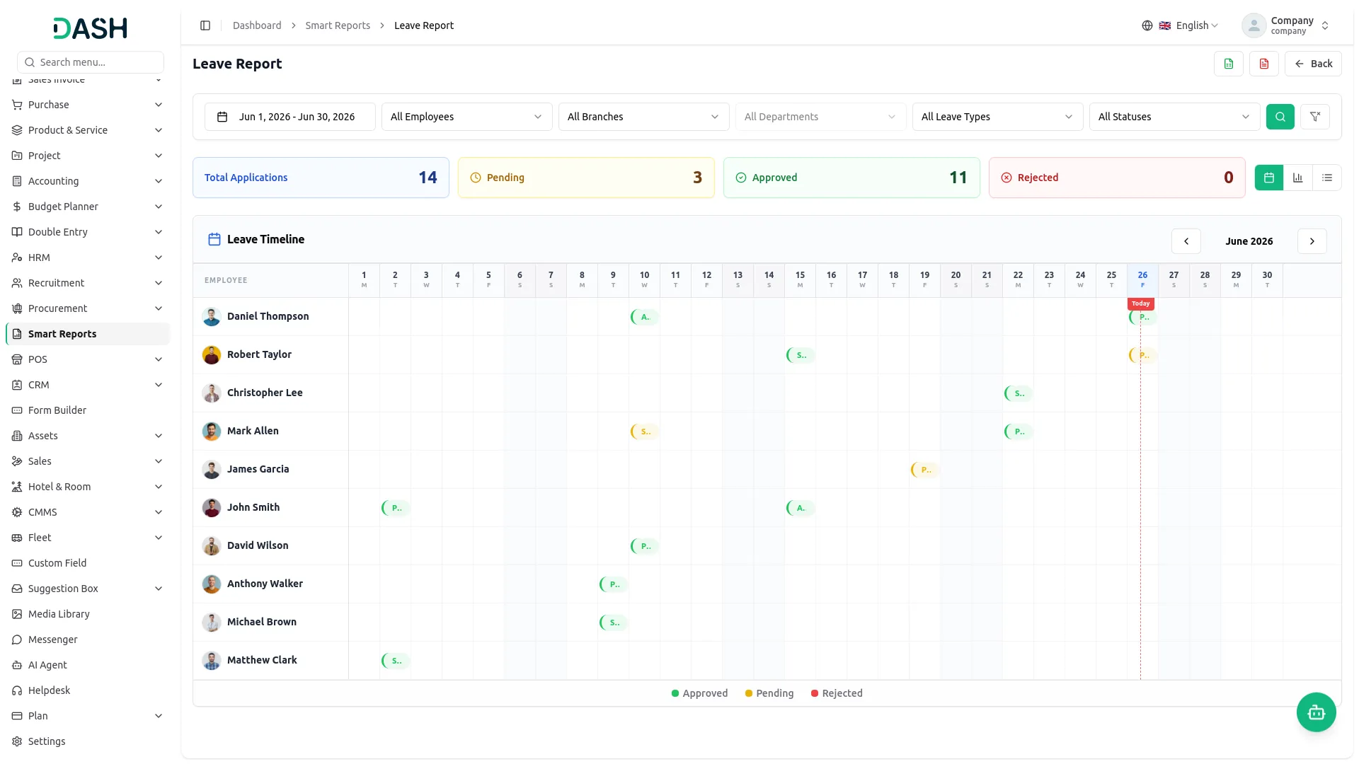
- The top summary bar displays four counts: Total Applications, Pending, Approved, and Rejected.
- The report has three views, toggled using the buttons on the right side of the summary bar. Calendar View is the default. Leave Timeline with one row per employee and each column representing one day of the selected month.
- Leave periods appear as coloured horizontal bars stretching across the relevant days, Approved, Pending, and Rejected, with the leave type name shown inside each bar.
- Hover over any bar to see a pop-up showing the leave type, date range, number of days, status, and reason. A red dashed vertical line marks today’s date on the timeline, and weekend columns appear with a slightly grey background. Employee names stay fixed on the left as the calendar scrolls horizontally. Use the left and right arrow buttons at the top right of the timeline to move between months.
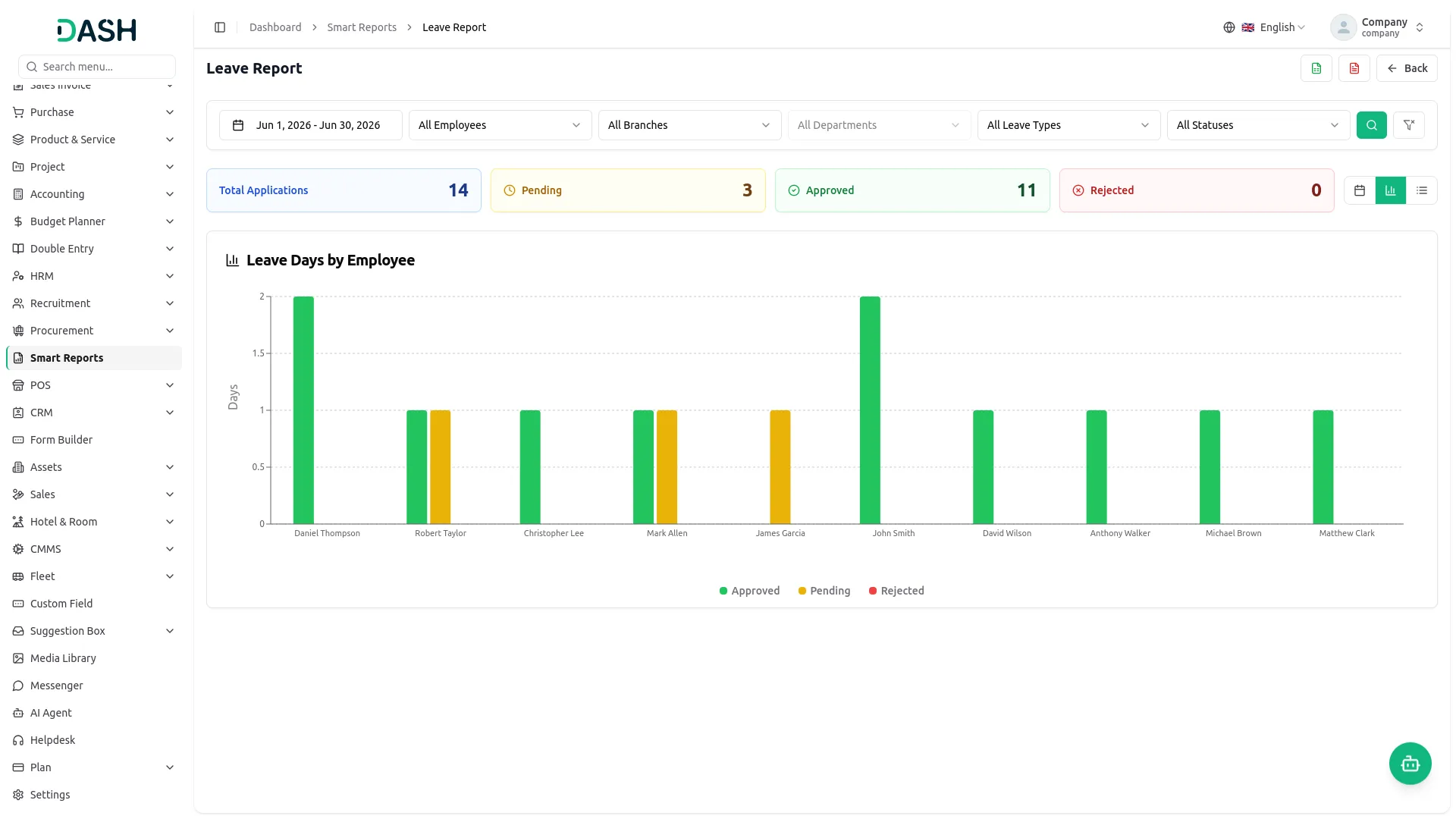
- Bar Chart View displays a grouped bar chart labelled Leave Days by Employee with one set of bars per employee, such as approved days, pending days, rejected days.
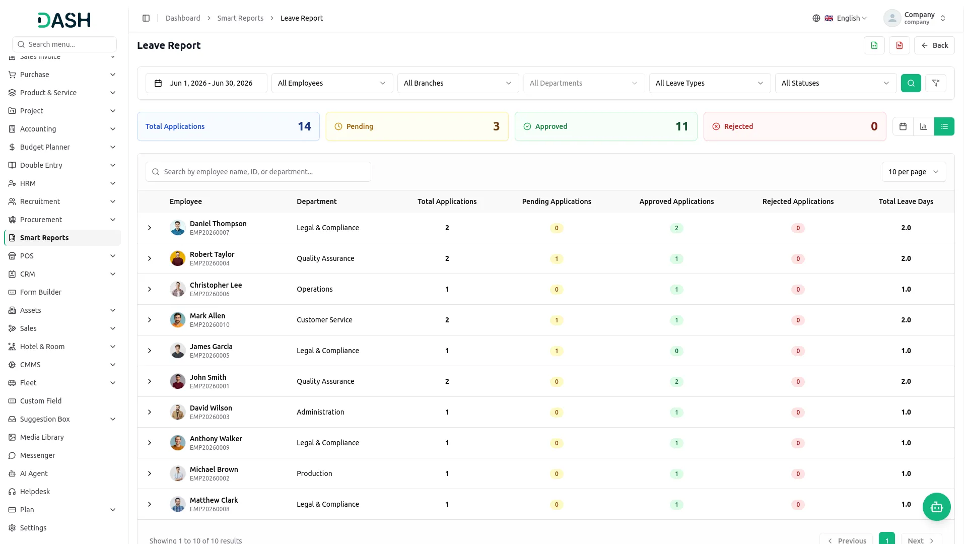
- Table View groups records by employee, with one summary row per person showing the employee name, ID, department, total applications, pending applications, approved applications, rejected applications, and total leave days.
- Click the arrow on any row to expand it and view each individual leave application, including the leave type, date range, number of days, reason, and status. Use the search box to filter by name, ID, or department, and use the pagination control to manage how many rows appear per page. Use the search bar to filter by name, ID, or department.
Sales Invoice Report
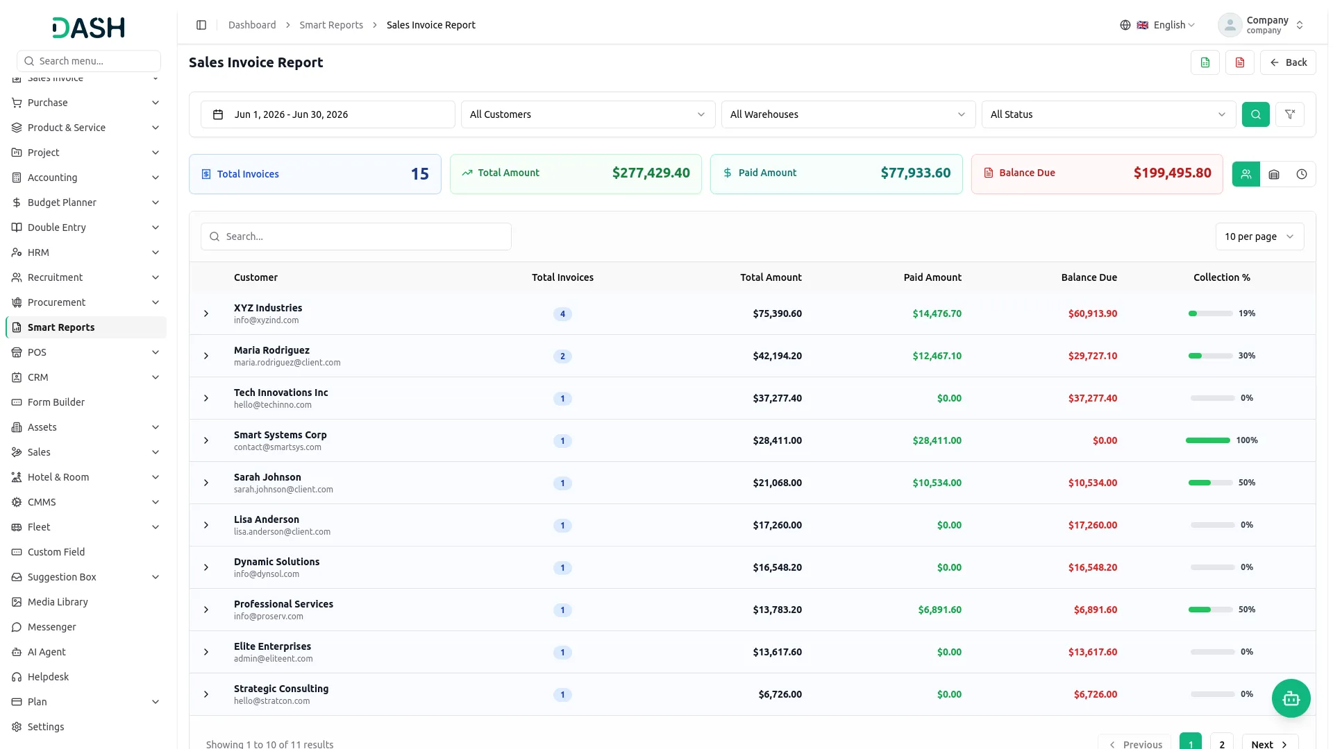
- The Sales Invoice Report shows all sales invoices raised for customers along with payment status, amounts billed, and outstanding balances. Set the date range, it defaults to the current month, filter by All Customers, All Warehouses, and All Status, and click the search option to generate the report.
- The Export Excel and Export PDF buttons appear at the top right of the report page. Click Export Excel to download the data as a spreadsheet, or click Export PDF to download a printable version.
- The top summary bar displays four key figures: Total Invoices, Total Amount, Paid Amount, and Balance Due.
- The report offers three grouping options, selected using the icons on the right side of the summary bar.
- By Customer is the default. Invoices are grouped by customer name and email, and each row shows the customer name and email, total invoice count, total amount billed, paid amount, balance due, and a green collection percentage bar indicating how much has been collected.
- Click the arrow on any row to expand it and see all invoices for that customer, including invoice number, warehouse, invoice date, due date, amount, paid amount, balance, and status.
- By Warehouse groups the same invoices by warehouse, and expanding a warehouse row reveals all invoices processed through that location.
- By Month groups invoices by billing month, for example, June 2026, and expanding a month row shows all invoices billed during that period. A search bar and pagination controls are available in all three grouping views.
Purchase Invoice Report
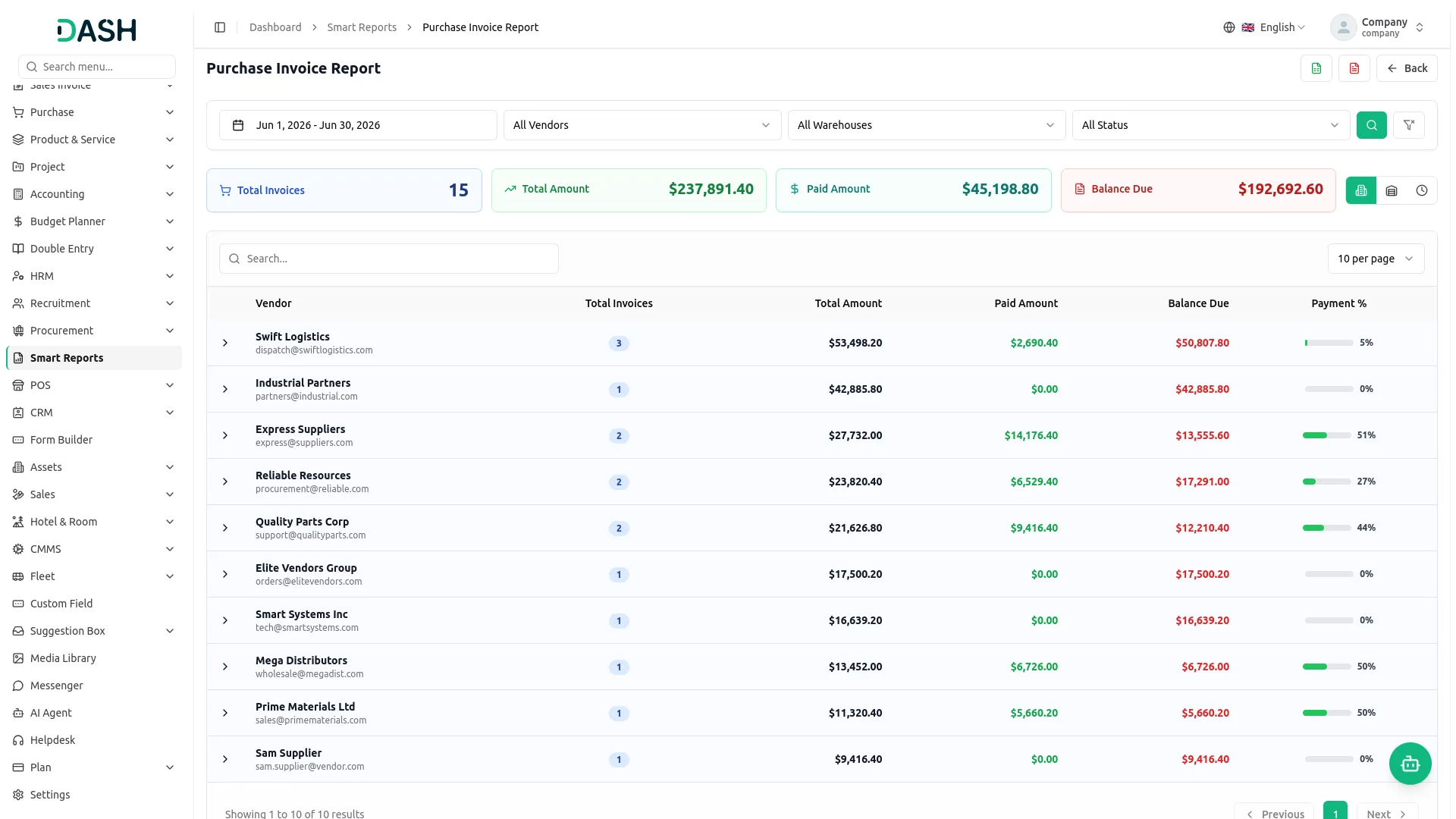
- The Purchase Invoice Report tracks all purchase invoices from vendors, including payment status and outstanding balances. Set the date range, it defaults to the current month, filter by All Vendors, All Warehouses, and All Status, and click the search option to generate the report.
- The Export Excel and Export PDF buttons appear at the top right of the report page. Click Export Excel to download the data as a spreadsheet, or click Export PDF to download a printable version.
- The top summary bar displays four key figures: Total Invoices, Total Amount, Paid Amount, and Balance Due.
- The report offers three grouping options, selected using the icons on the right side of the summary bar.
- By Vendor is the default. Invoices are grouped by vendor name and email, and each row shows the vendor name and email, total invoice count, total amount, paid amount, balance due, and a payment percentage bar showing how much has been settled.
- Click the arrow on any row to expand it and see all invoices from that vendor, including invoice number, warehouse, invoice date, due date, amount, paid amount, balance, and status.
- By Warehouse, groups invoices by warehouse, and expanding a warehouse row reveals all invoices associated with that location.
- By Month groups invoices by billing month, for example, June 2026, and expanding a month row shows all invoices from that period. A search bar and pagination controls are available in all three grouping views.
Deal Pipeline Report
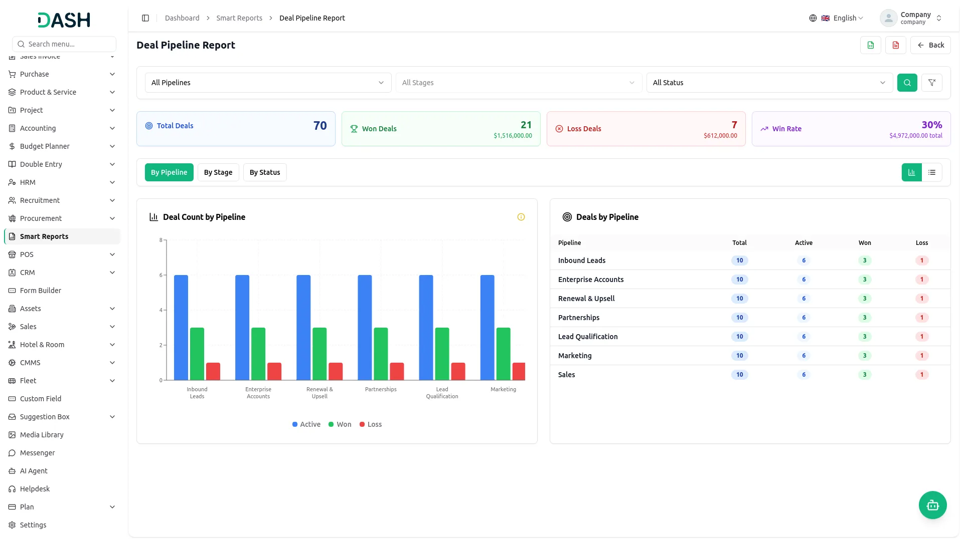
- The Deal Pipeline Report provides a full view of your CRM sales pipeline, deals that are active, won, or lost across all pipelines and stages. Filter by All Pipelines, All Stages, and All Status, and click the search option to generate the report. Click the clear filter option to reset all filters.
- The Export Excel and Export PDF buttons appear at the top right of the report page. Click Export Excel to download the data as a spreadsheet, or click Export PDF to download a printable version.
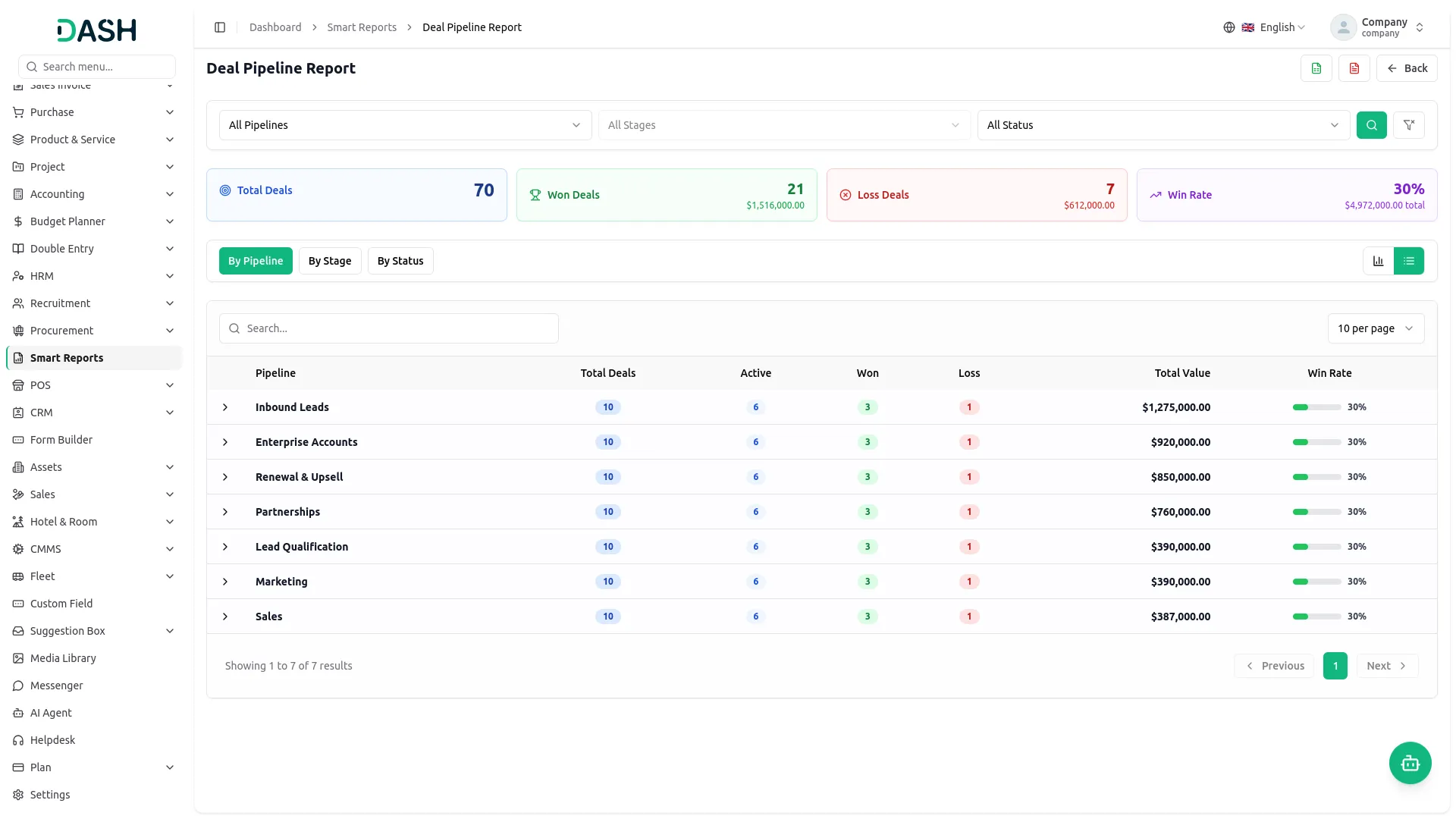
- The top summary bar displays four key figures: Total Deals, Won Deals with the total won value shown below, Loss Deals with the total lost value shown below, and Win Rate as a percentage with the total pipeline value shown below.
- The report offers three grouping options, By Pipeline, By Stage, and By Status, selected using the buttons above the report area, and two views toggled using the icons on the right side of those buttons.
- Chart View is the default. The screen splits into two panels. The left panel displays a Deal Count by Pipeline bar chart with one set of bars per group, where each set: Active deal count, Won deal count, and Loss deal count.
- A colour legend beneath the chart identifies each segment. Hover over any bar to see exact counts in a tooltip. Click any bar to load that group’s deals in the right panel.
- The right panel shows a Deals by Pipeline summary table by default, listing each pipeline with its total, active, won, and loss counts. After clicking a bar, the right panel updates to show a mini summary strip and a detailed table of every deal in that group, including deal name, stage, value, and status.
- Click the clear button at the top right of the panel to return to the full group summary. Table View displays each group as one collapsible row showing the pipeline name, total deals, active count, won count, loss count, total value, and a win rate percentage bar.
- Click the arrow on any row to expand it and see every individual deal within that group, including deal name, stage, value, and status. Use the search bar at the top to find deals by name or pipeline.
Product Stock Report
- The Product Stock Report provides a current inventory overview for all products, broken down by category or warehouse. Filter by All Categories, All Warehouses, All Types, and the stock status filter, and click the search option to generate the report. Click the clear filter option to reset all filters.
- The Export Excel and Export PDF buttons appear at the top right of the report page. Click Export Excel to download the data as a spreadsheet, or click Export PDF to download a printable version.
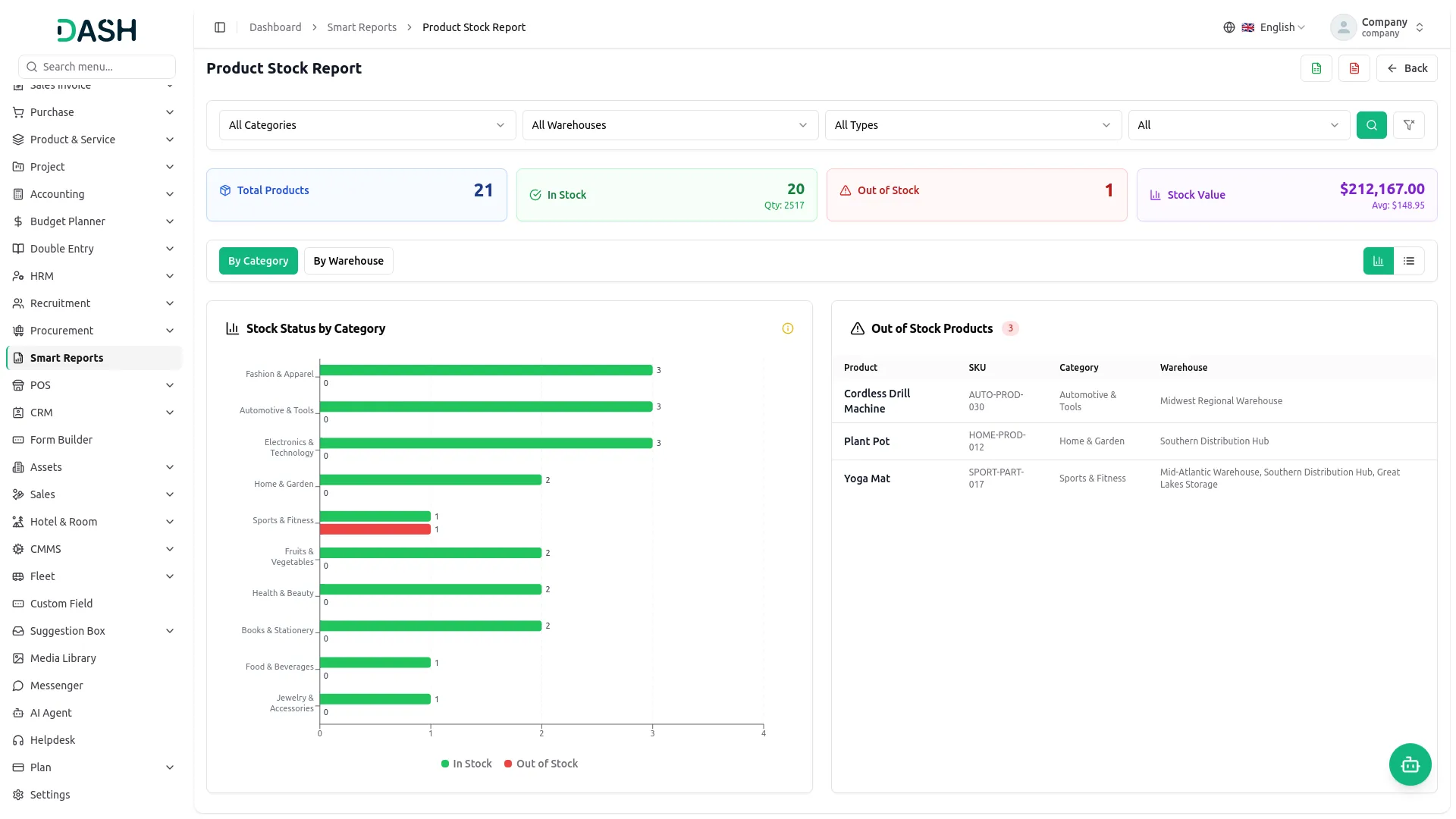
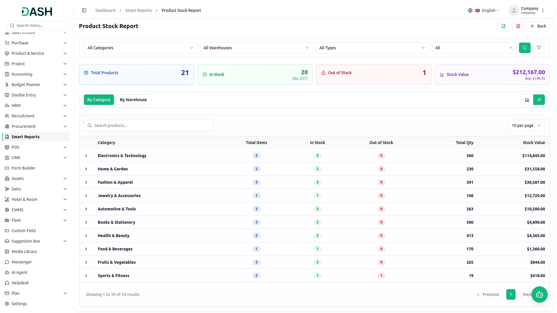
- The top summary bar displays four key figures: Total Products, In Stock count with the total quantity shown below, Out of Stock count, and Stock Value with the average sale price shown below.
- The report offers two grouping options, By Category and By Warehouse, selected using the buttons above the report area, and two views toggled using the icons on the right.
- Chart View is the default. The screen splits into two panels. The left panel displays a Stock Status by Category horizontal bar chart with one row per category or warehouse.
- Each row has two bars, the in-stock product count and a red bar for the out-of-stock product count, with the exact count shown as a label next to each bar. A colour legend beneath the chart identifies each bar.
- The right panel shows an Out of Stock Products list by default, displaying each out-of-stock product’s name, SKU, category, and warehouse.
- Table View displays each category or warehouse as one collapsible row showing the name, total items, in-stock count, out-of-stock count, total quantity, and total stock value. Click the arrow on any row to expand it and see every product within that group. Use the search bar at the top to find products by name.
Project Progress Report
- The Project Progress Report shows the current status of all projects, tasks completed, milestones, budget used, and health. Set the date range, it defaults to the current month; filter by All Status and All Projects, and click the search option to generate the report. Click the clear filter option to reset all filters.
- The Export Excel and Export PDF buttons appear at the top right of the report page. Click Export Excel to download the data as a spreadsheet, or click Export PDF to download a printable version.
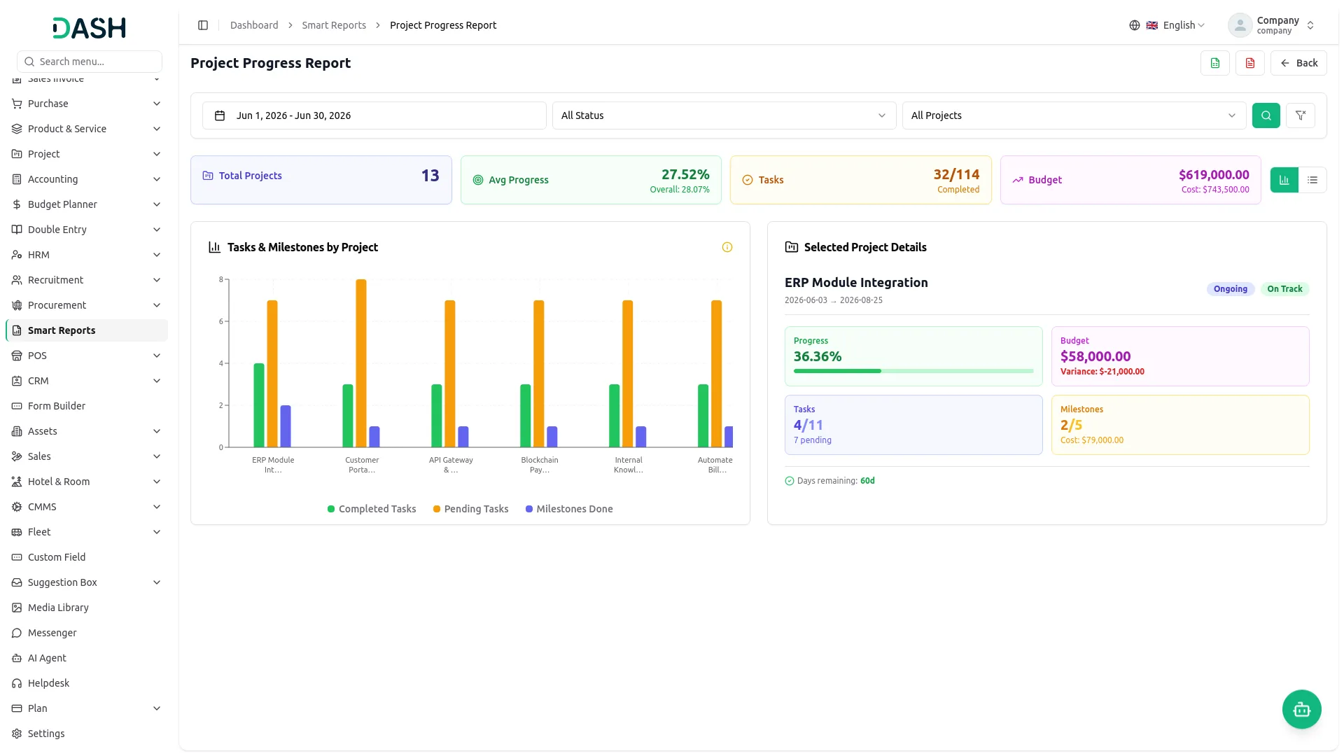
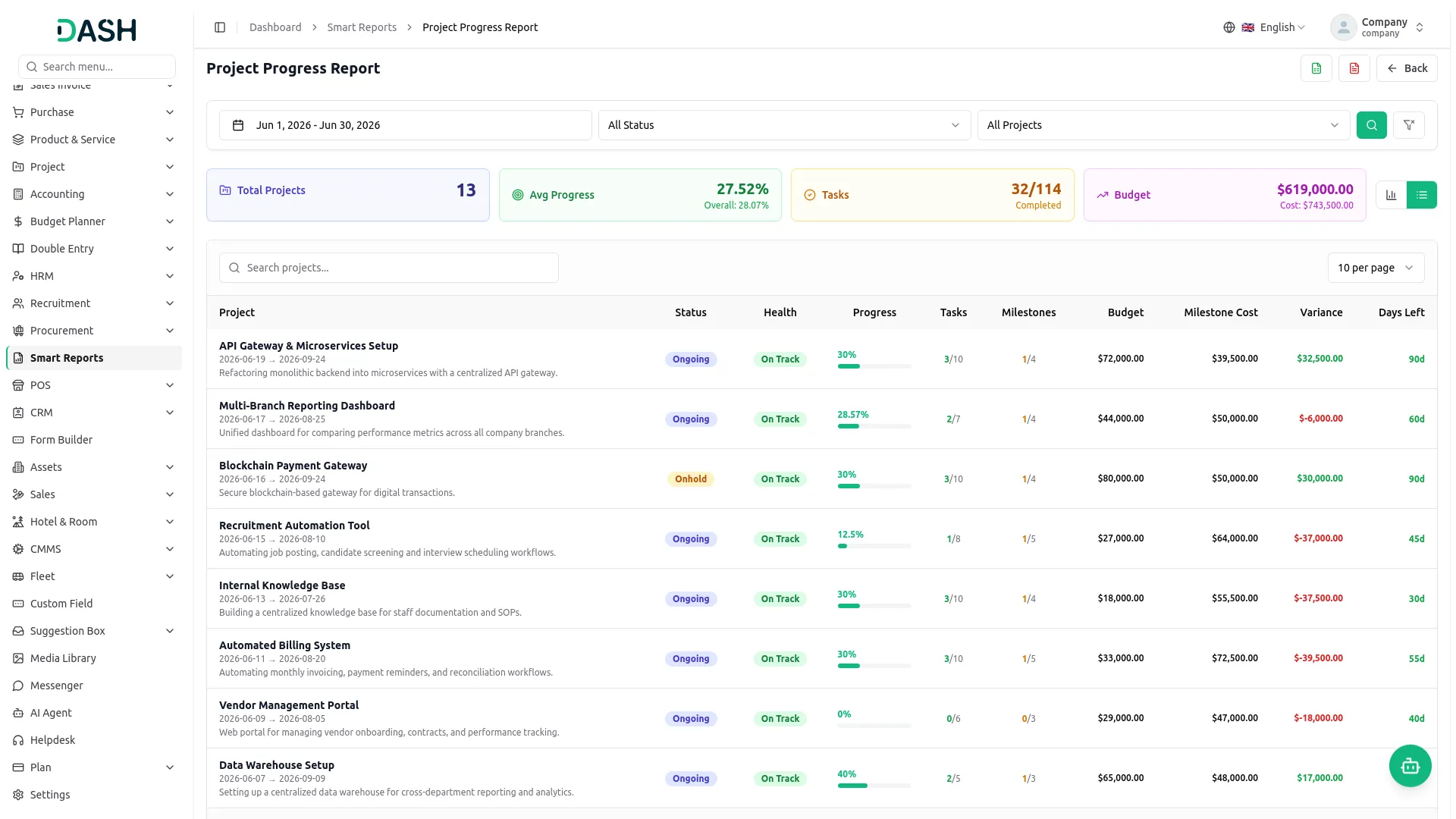
- The top summary bar displays four key figures: Total Projects, Avg Progress as a percentage with the overall completion percentage shown below, Tasks showing the completed count out of total tasks with a Completed label, and Budget showing the total budget amount with the total cost shown below.
- The report has two views, toggled using the icons on the right side of the summary bar. Chart View is the default. The screen splits into two panels. The left panel displays a Tasks & Milestones by Project bar chart with one set of bars per project, Completed Tasks, Pending Tasks, and Milestones Done.
- Hover over any bar to see a tooltip showing the completed tasks, milestones done, and pending tasks for that project. Click any bar or project label to load that project’s details in the right panel.
- The right panel shows Selected Project Details for the currently selected project, displaying the project name and date range at the top, a status badge (Ongoing, Delayed).
- Below those, four tiles show the full breakdown: the Progress tile shows the completion percentage with a progress bar; the Budget tile shows the total budget and a variance figure in green if under budget or red if over; the Tasks tile shows the completed and total task count with the number of pending tasks below it; and the Milestones tile shows the completed and total milestone count with the milestone cost.
- At the bottom, the days remaining for the project are shown — in green when on track, in amber when within 7 days, or in red with an overdue label if the deadline has passed.
- Table View displays each project as one row showing the project name, date range, and short description; a status badge; a health badge; progress percentage with a small progress bar, tasks as completed out of total; milestones as completed out of total, budget amount; milestone cost; variance in green or red; and days left, shown in red as overdue if the deadline has passed. Use the search bar at the top to find projects by name.
Categories
Related articles
- Authorize.Net – BookingGo SaaS Add-On Guide
- Exam – WorkDo Dash SaaS Add-On Guide
- Workflow – WorkDo Dash SaaS Add-On Guide
- Easy Deposit Payments – BookingGo SaaS Add-On Guide
- Google Captcha – WorkDo Dash SaaS Add-On Guide
- Assets – WorkDo Dash SaaS Add-On Guide
- Tip – BookingGo SaaS Add-On Guide
- Pharmacy Management – WorkDo Dash SaaS Add-On Guide
- Zendesk – TicketGo Add-On Guide
- Sign in with LinkedIn – WorkDo Dash SaaS Add-On Guide
- Social Media Analytics – WorkDo Dash SaaS Add-On Guide
- Rental Management – WorkDo Dash SaaS Add-On Guide
We're Here to Help - Let's Talk
Have questions about our solutions, customization services, or business tools? Our team is here to help you. let's talk.