
Smart Dashboard Analytics – WorkDo Dash SaaS Add-On Guide
Real-time business insights, KPIs, and cross-module performance analytics.
Introduction
The Smart Dashboard Analytics Add-On provides a centralized, real-time analytics platform that consolidates key business insights across finance, sales, CRM, HRM, inventory, projects, POS, and purchasing into a single, intuitive dashboard. It enables decision-makers to monitor organizational performance through executive summaries, financial analytics, customer and sales insights, operational metrics, and interactive charts, tables, and KPI cards. With built-in alerts, performance tracking, trend analysis, detailed transaction reports, and export capabilities, the Add-On helps businesses quickly identify opportunities, address critical issues, and make data-driven decisions without navigating multiple modules.
Note : For complete and accurate data display, HRM, CRM, Accounts, POS, Projects, Sales, and Product Service add-ons are required and must be enabled, as Smart Dashboard uses data from these add-ons to display dashboard widgets and analytics.
How To Install The Add-On?
To set up the Smart Dashboard Analytics Add-On, you can follow this link: Setup Add-On.
How to Use The Smart Dashboard Analytics Add-On?
Executive Overview
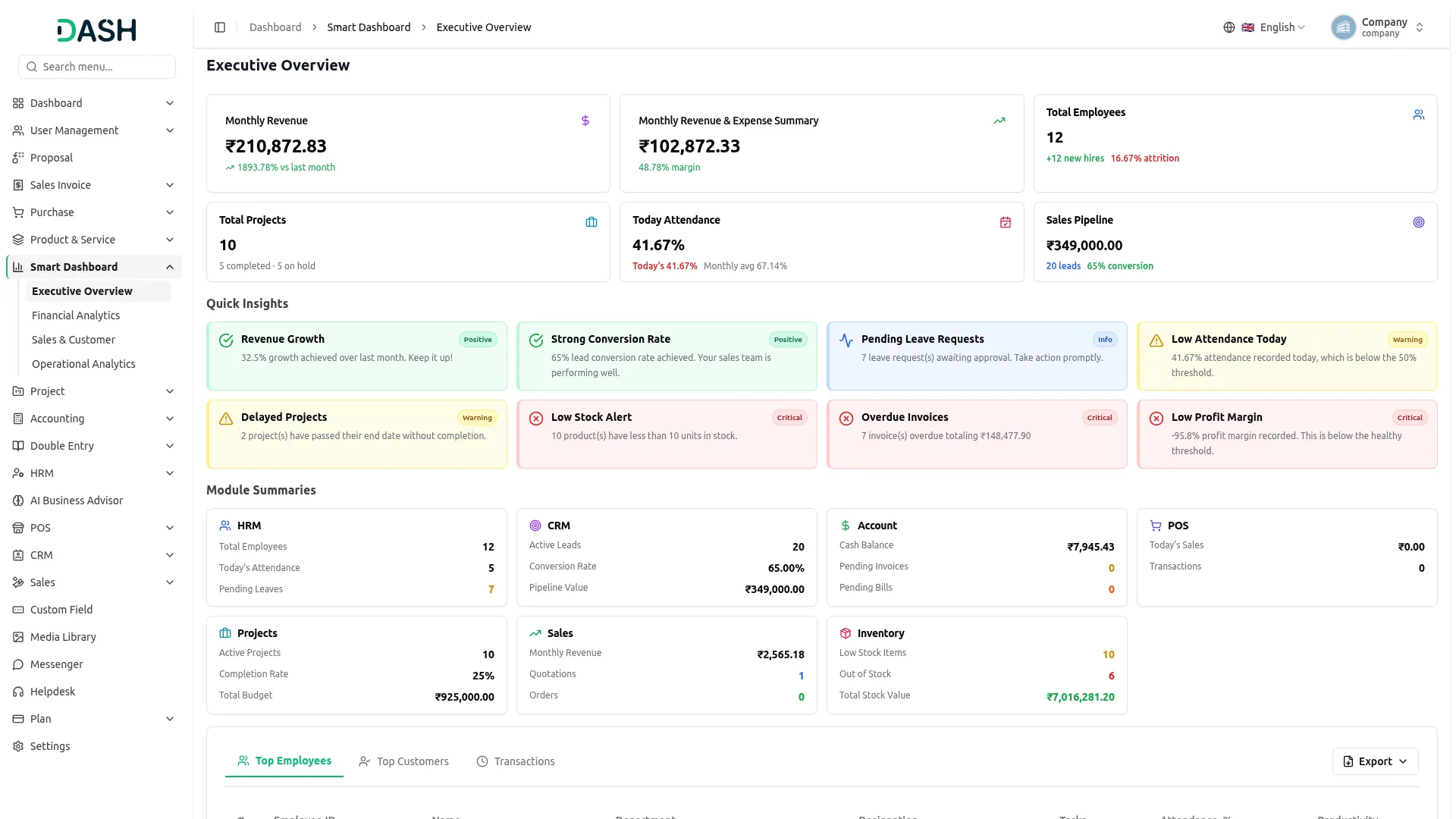
- The Executive Overview gives you a complete snapshot of your business across all active modules in a single view.
Summary Cards
- Six summary cards are arranged in two rows of three at the top of the page. Monthly Revenue shows the current month’s total and a percentage change compared to the previous month, displayed with an upward or downward indicator.
- Monthly Revenue & Expense Summary shows the net figure after subtracting total expenses from revenue, along with the resulting margin percentage; a warning icon appears when the margin falls below a healthy threshold.
- Total Employees shows the total number of active staff members, the number of new hires for the month, and the attrition rate. Total Projects shows the total number of active projects along with how many are completed and how many are on hold.
- Today’s Attendance shows today’s attendance percentage alongside the monthly average. Sales Pipeline shows the total pipeline value, the number of active leads, and the current lead-to-deal conversion percentage.
Quick Insights
- The Quick Insights section displays alert cards that appear only when a condition is triggered. Each card is color-coded by severity: red Critical cards flag issues that need immediate attention, yellow Warning cards highlight items to monitor closely, green Positive cards confirm areas performing well, and blue Info cards surface items that require follow-up.
- Each card displays a short title and a one-line description of what triggered it, for example, the number of products below the minimum stock threshold, the count and total value of overdue invoices, the month-over-month revenue growth rate, the current lead conversion rate, how many leave requests are pending approval, how many projects have passed their end date, or the current profit margin compared to the healthy threshold.
- A Low Attendance Today card showing today’s attendance rate when it falls below the 50% threshold, or the current profit margin compared to the healthy threshold.
- Cards that are not triggered do not appear, so the number visible on any given day reflects current business conditions.
Module Summaries
- The Module Summaries section displays individual cards for seven modules: HRM, CRM, Account, POS, Projects, Sales, and Purchase. Each card shows the two or three most critical metrics for that module at a glance.
- For example, the HRM card shows Total Employees, Today’s Attendance, and Pending Leaves; the CRM card shows Active Leads, Conversion Rate, and Pipeline Value; the Account card shows Cash Balance, Pending Invoices, and Pending Bills; the POS card shows Today’s Sales and Transaction count. The Projects card shows Active Projects, Completion Rate, and Total Budget.
- The Sales card shows Monthly Revenue, Quotations, and Orders; and the Inventory card shows Low Stock Items, Out of Stock count, and Total Stock Value. These cards let you monitor cross-module health without leaving the Executive Overview page.
Performance Tables
- Three tabs at the bottom of the page, Top Employees, Top Customers, and Transactions, let you switch between ranked views of activity data.
- The Top Employees tab shows a table listing the top 10 performing employees with their Employee ID, Name, Department, Designation, number of Tasks assigned, Attendance %, and a Productivity score.
- The Top Customers tab displays the top 10 customers as a ranked card grid rather than a table. Each customer gets their own card showing their rank number and an Active or Inactive status badge. Within each card, the following fields are shown: Orders (number of orders placed), Gross Revenue (total billed before deductions), Returns (value of returned orders, shown in red), Net Revenue (gross revenue minus returns, highlighted for quick scanning), Total Paid (amount collected so far), Outstanding (unpaid balance, shown in red when non-zero), Avg Order Value, and Last Purchase date.
- Cards are arranged four across per row, with active customers ranked first, followed by inactive ones. An Export button in the top right lets you download the current dataset for whichever tab is active.
- The Transactions tab shows a paginated table of the most recent financial activity across all modules. Each row displays a transaction Date, a Type badge (Expense, Revenue, or POS Sale), the source Module, the Amount, and a Status badge.
- Status values are Posted for finalized accounting entries, Draft for entries not yet confirmed, and Completed for finished POS sales. An Export button in the top right is available across all three tabs to download the currently visible dataset.
Financial Analytics
- The Financial Analytics section provides a detailed view of your company’s financial position. Five tabs at the top of the page — Revenue, Expenses, Profitability, Cash Flow, and Journal Entries, let you navigate between different financial views.
Revenue
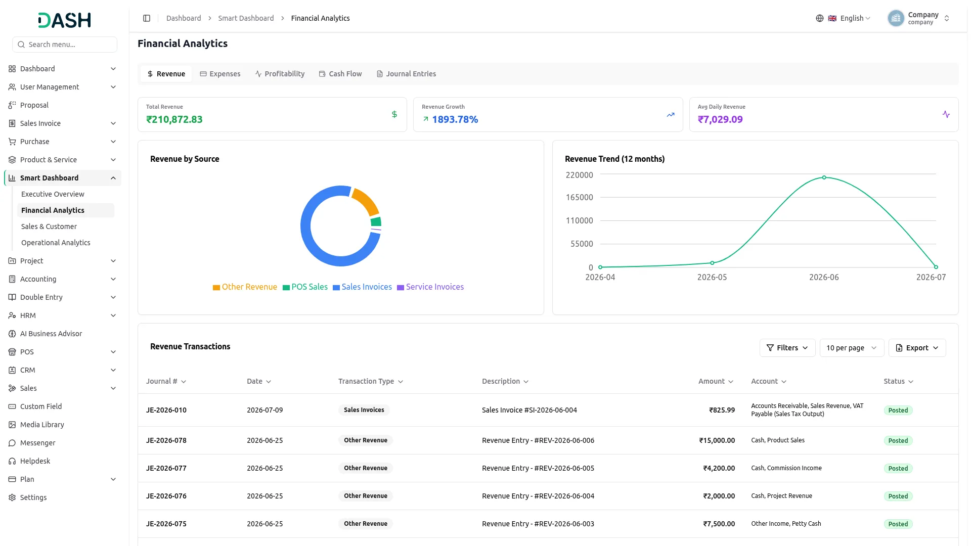
- Three summary cards at the top of the Revenue tab give you an instant read on revenue performance for the current period. Total Revenue shows the combined revenue figure recorded across all sources for the period.
- Revenue Growth shows the percentage change compared to the previous period; a green upward arrow indicates that revenue has grown, while a downward indicator signals a decline.
- Avg Daily Revenue shows the average amount earned per day, giving you a normalized view of the daily earning pace regardless of how long the current period has been running.
- The Revenue by Source donut chart breaks total revenue into four transaction types: Other Revenue, POS Sales, Sales Invoices, and Service Invoices. Each segment is color-coded, and a legend beneath the chart identifies each source by name.
- The Revenue Trend (12 months) line chart on the right side of the page plots monthly revenue across the trailing twelve months. The horizontal axis shows the month, and the vertical axis shows the revenue value, giving you a visual read on whether revenue is growing, declining, or holding steady over time.
- The Revenue Transactions table below the charts lists each revenue entry with its Journal #, Date, Transaction Type, Description, Amount, Account, and Status.
- A collapsible filter row, toggled using the Filters button in the top right, provides Date From and Date To date pickers, a Transaction Type dropdown, and a Status dropdown. Click Apply to run the filter or Reset to clear all selections. Results can be downloaded using the Export button in the top right of the table.
Expenses
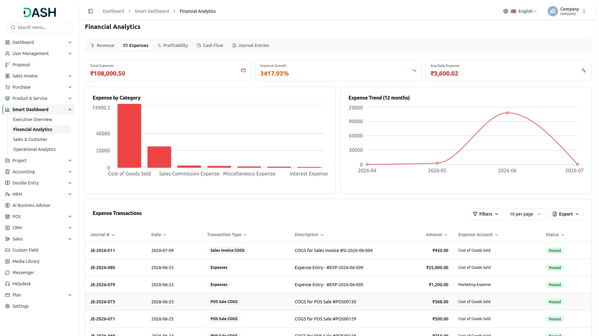
- Three summary cards at the top of the Expenses tab give you an instant read on spending for the current period. Total Expenses shows the combined amount recorded across all expense types and categories for the period.
- Expense Growth shows the percentage change in total expenses compared to the previous period, displayed with a trend indicator to show the direction. Avg Daily Expense shows the average amount spent per day, giving you a normalized view of daily spending pace across the period.
- The Expense by Category vertical bar chart shows spending broken down by expense category, with bar height representing the total amount for each category. Categories are ordered from highest to lowest spend.
- The Expense Trend (12 months) line chart on the right plots monthly expense totals across the trailing twelve months. The horizontal axis shows the month and the vertical axis shows the expense value, letting you see whether spending is growing, declining, or holding steady over time.
- The Expense Transactions table below the charts lists each expense entry with its Journal #, Date, Transaction Type, Description, Amount, Expense Account, and Status. Transaction types include entries such as Expenses, Sales Invoice COGS, and POS Sale COGS.
- A collapsible filter row, toggled using the Filters button in the top right, provides Date From and Date To date pickers, a Transaction Type dropdown, and an Expense Category dropdown. Click Apply to run the filter or Reset to clear all selections. Results can be downloaded using the Export button in the top right of the table.
Profitability
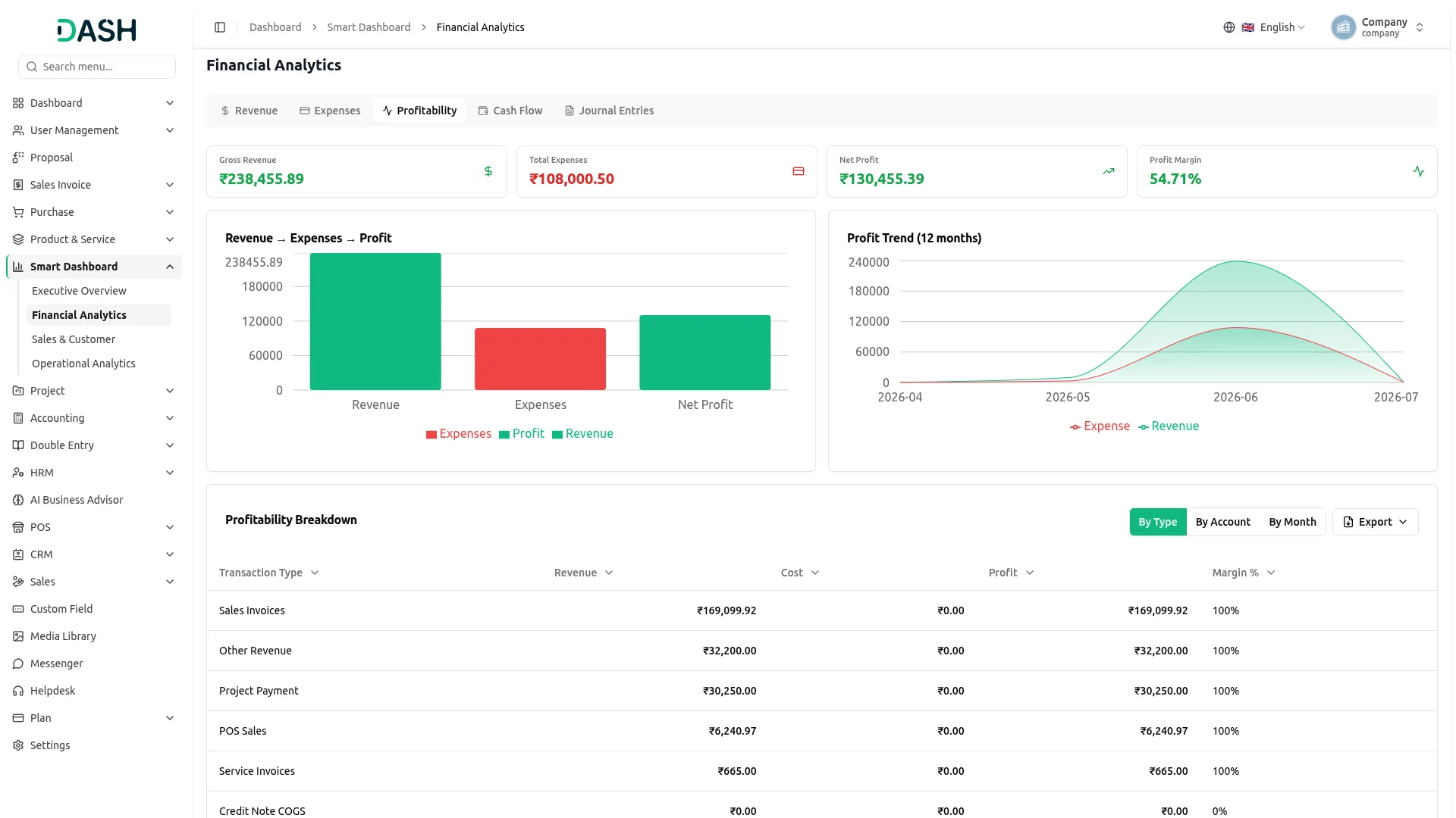
- Four summary cards at the top of the Profitability tab show the key figures that determine business profitability for the period. Gross Revenue shows the total revenue earned from all sources before any deductions. Total Expenses shows the combined cost of all expenditure recorded during the period.
- Net Profit shows the amount remaining after total expenses are subtracted from gross revenue. Profit Margin % shows net profit expressed as a percentage of gross revenue, indicating how much of each earned is retained as profit.
- The left chart, titled Revenue → Expenses → Profit, presents Revenue, Expenses, and Net Profit as three side-by-side vertical bars, allowing you to compare their relative sizes instantly.
- A color legend below the chart identifies each bar: green for Revenue, red for Expenses, and green for Profit. When expenses exceed revenue for the period, the Net Profit bar switches to red to flag the loss, so the chart always reflects whether the business made or lost money for that period at a glance.
- The Profit Trend (12 months) area chart on the right plots expense and revenue lines over the trailing twelve months. Two labeled series, expense and revenue, let you see whether the gap between revenue and costs is widening or narrowing over time.
- The Profitability Breakdown table below the charts can be viewed in three ways, selected using the toggle buttons in the top right of the table: By Type, By Account, and By Month.
- In By Type view, each row represents a transaction type, such as project payment, Service Invoices, POS Sales, Other Revenue, or Sales Invoices, and shows the Revenue, Cost, Profit, and Margin % for that type.
- In By Account view, each row represents an individual account (such as Interest Expense, Marketing Expense, Employee Benefits, Cost of Goods Sold, or Sales Revenue) with its account Code, Type (Expense or Revenue), and Amount.
- In By Month view, each row represents a calendar month and shows that month’s Revenue, Expense, and Profit totals side by side. An Export button in the top right allows you to download whichever view is currently active.
Cash Flow
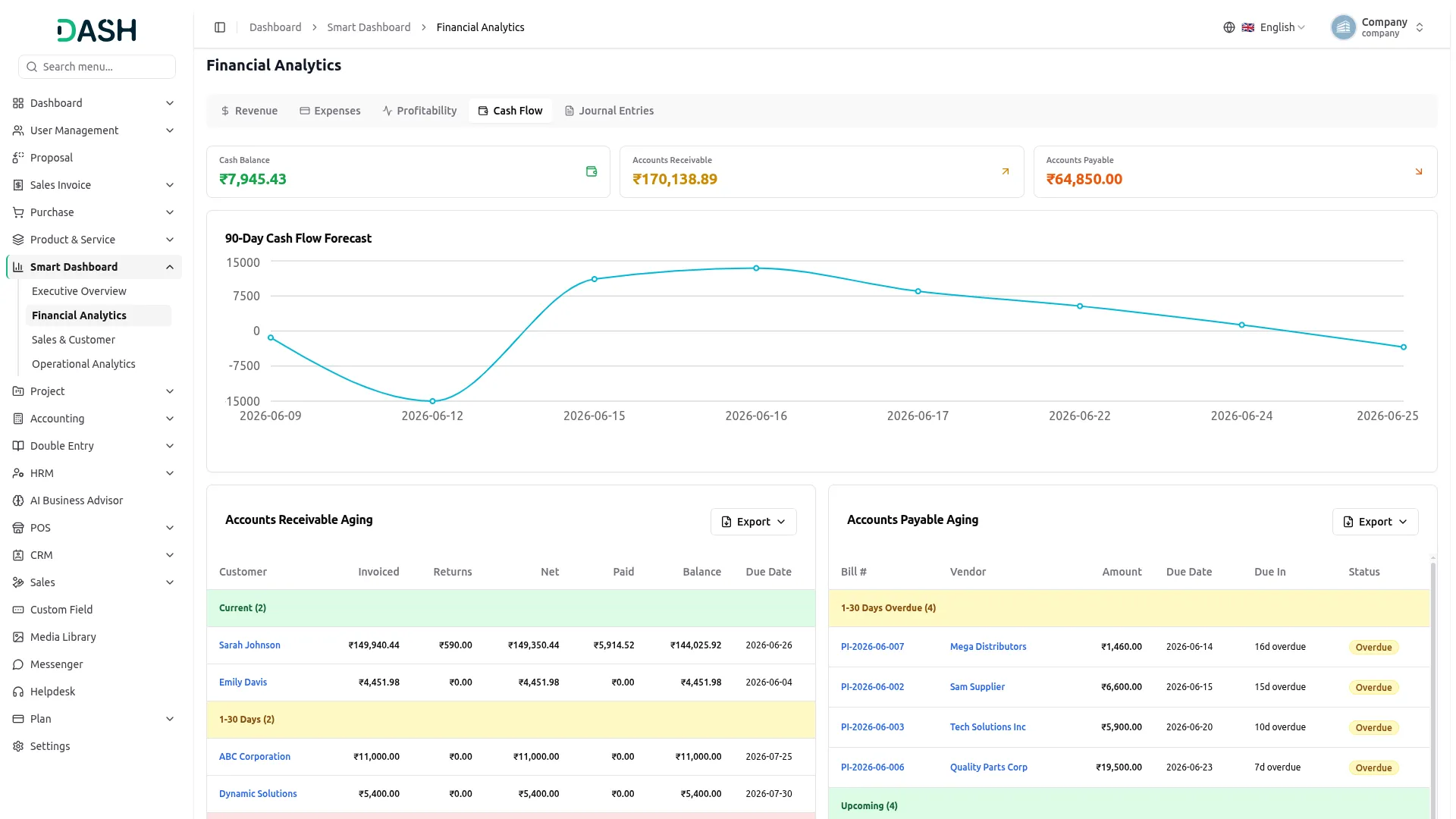
- Three summary cards at the top of the Cash Flow tab show the current state of your liquidity position. Cash Balance shows the total cash currently held in your bank accounts, displayed in green when positive. Accounts Receivable shows the total amount owed to you by customers, money that has been invoiced but not yet collected.
- Accounts Payable shows the total amount you owe to vendors, bills that have been recorded but not yet paid; both receivable and payable figures are displayed in orange to draw attention to the outstanding exposure on each side.
- The 90-Day Cash Flow Forecast line chart plots projected cash movement across a 90-day period, with calendar dates on the horizontal axis and cash amounts on the vertical axis.
- Hovering over any point on the line shows a tooltip with the date and the Net Cash Flow value for that day. Dips below zero indicate periods where outflows are expected to exceed the current cash balance, and the shape of the line shows when cash positions are expected to recover.
- The Accounts Receivable Aging table on the left lists customers who owe you money, grouped by how long the balance has been outstanding. The groups shown are Current, 1–30 Days, 31–60 Days, and 61–90 Days.
- Each row shows the Customer name (displayed as a clickable link), the Invoiced amount, Returns, Net balance, amount Paid so far, Balance remaining, and Due Date. The grouping by age helps you prioritize follow-up on the oldest outstanding amounts first. An Export button is available above the table.
- The Accounts Payable Aging table on the right lists outstanding bills to vendors, similarly grouped by due status. Each row shows the Bill #, Vendor name, Amount, Due Date, the number of days overdue or until due (Due In), and a Status badge. Bills past their due date display an Overdue badge; bills not yet due display a Pending badge. An Export button is available above this table as well.
Journal Entries
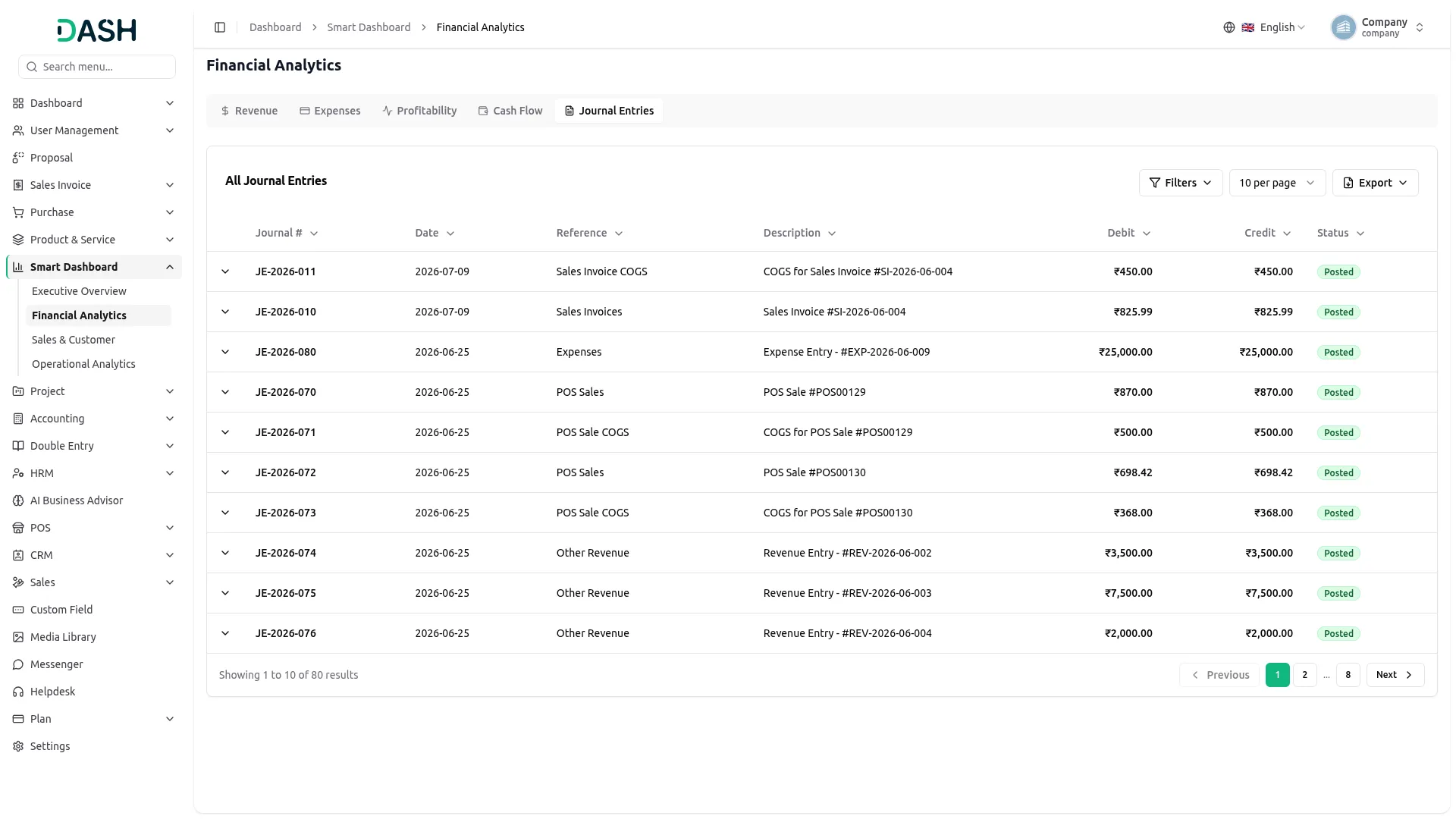
- The Journal Entries tab displays a complete list of all accounting entries recorded in the system. A collapsible filter row, toggled using the Filters button in the top right, includes Date From and Date To date pickers and a Status dropdown. Click Apply to run the filter or Reset to clear it.
- The table displays each entry’s Journal #, Date, Reference, Description, Debit amount, Credit amount, and Status. The Reference column identifies the source transaction type — for example, Sales Invoices, Sales Invoice COGS, Expenses, POS Sales, POS Sale COGS, or Other Revenue.
- Finalized entries display a posted status badge. Clicking the expand arrow on any row reveals the sub-lines that make up that journal entry. Pagination controls at the bottom of the table let you move through the full results set, and the Export button in the top right let you control view size and download the current filtered view.
Sales & Customer
The Sales & Customer section consolidates your CRM pipeline, deal tracking, invoicing, proposals, purchasing, and customer analytics into one place. Seven tabs at the top of the page — CRM & Leads, Deals, Sales Invoices, Proposals, Purchases, Customers, and Sales vs Purchase; let you switch between views.
CRM & Leads
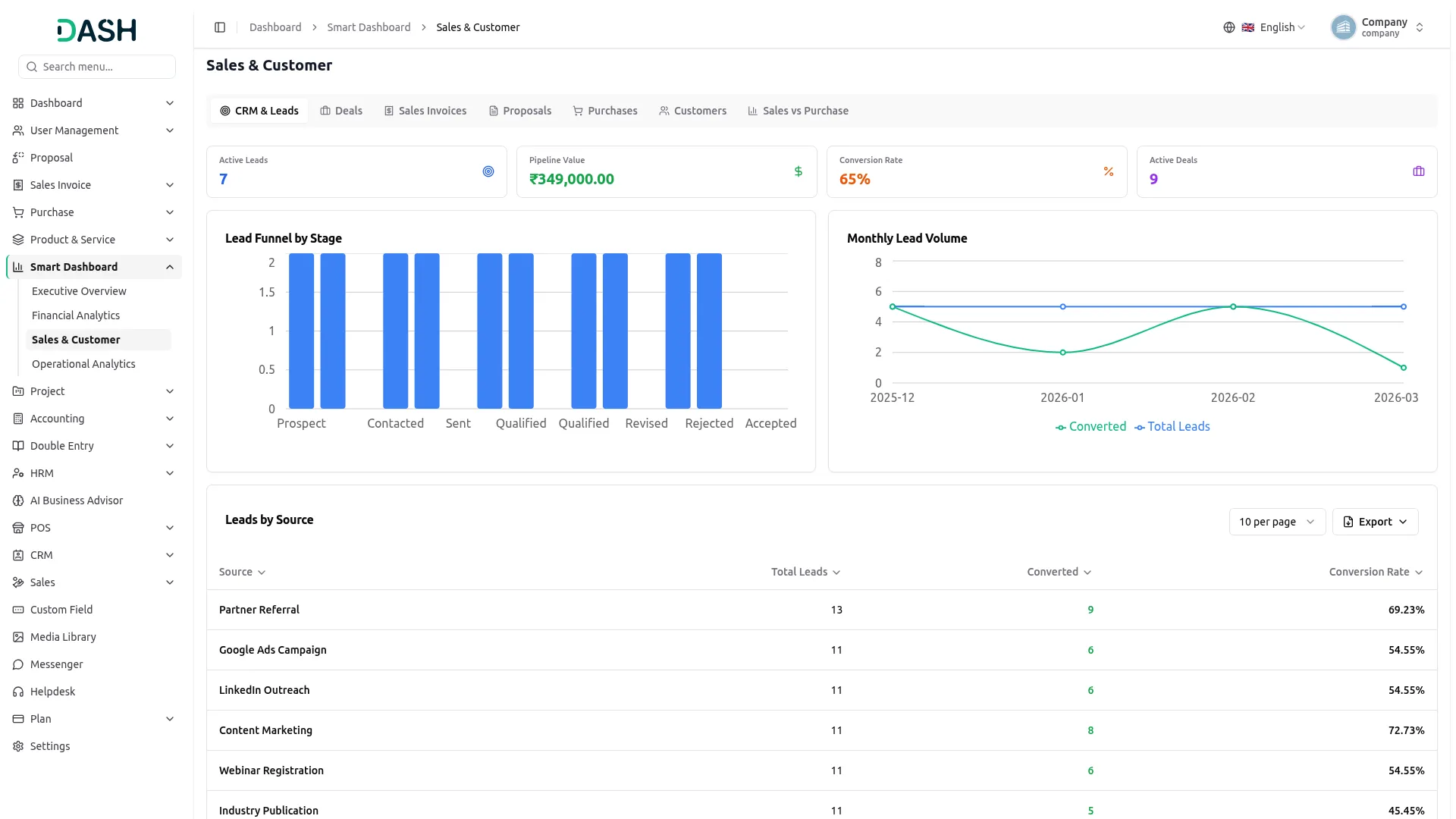
- Four summary cards at the top of the CRM & Leads tab show Active Leads (the number of leads currently in the pipeline), Pipeline Value (the total potential value of all active leads), Conversion Rate (the percentage of leads that have been converted to deals), and Active Deals (the number of deals currently open).
- The Lead Funnel by Stage bar chart on the left shows how many leads sit at each stage of your sales process: Prospect, Draft, In Review, Sent, Qualified, Open, Revised, Rejected, and Accepted. Bar height reflects the volume at each stage, making it easy to spot where leads are concentrated and where they may be stalling.
- The Monthly Lead Volume line chart on the right tracks two series, Converted and Total Leads, across recent months. This shows whether overall lead generation is growing and whether the proportion being converted is keeping pace with inbound volume.
- The Leads by Source table below the charts lists each lead source, such as Partner Referral, Google Ads Campaign, LinkedIn Outreach, Content Marketing, Webinar Registration, Industry Publication, Email Marketing, and Website Contact Form, alongside the Total Leads generated from that source, the number Converted, and the Conversion Rate %.
- This breakdown lets you identify which channels are delivering the highest-quality leads and which are generating volume without producing conversions. An Export button is available in the top right of the table.
Deals
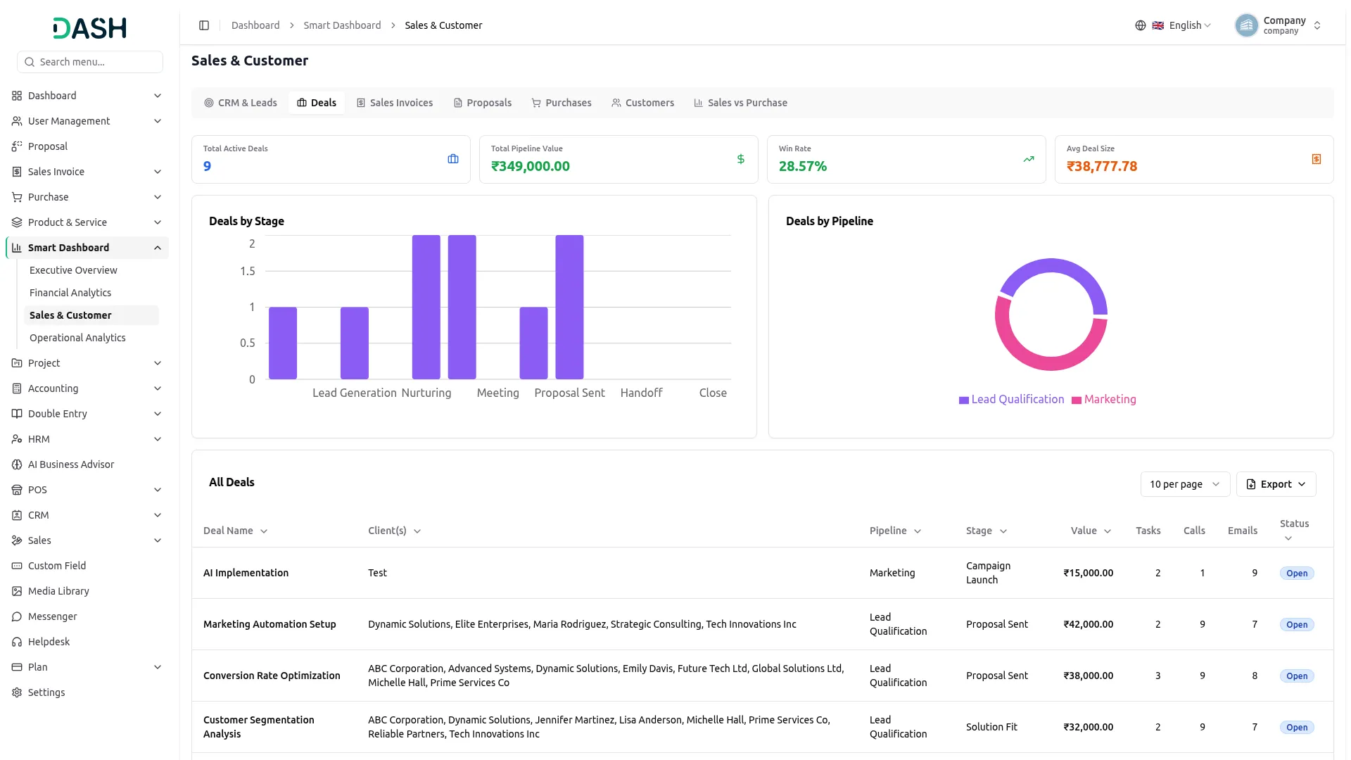
- Four summary cards at the top of the Deals tab show Total Active Deals, Total Pipeline Value, Win Rate (the percentage of deals marked as won), and Avg Deal Size (the average value per deal across all active deals).
- The Deals by Stage bar chart shows how many deals are currently at each pipeline stage — Initial Contact, Needs Assessment, Solution Fit, Qualification, Proposal, Handoff, Decision, and Close. This gives you a visual read on pipeline distribution and helps identify stages where deals are stacking up.
- The Deals by Pipeline donut chart on the right breaks active deals down by pipeline type, with each segment representing a different pipeline and a legend identifying each one.
- The All Deals table below lists each deal with its Deal Name, Client(s), Pipeline, Stage, Value, Tasks, Calls, Emails, and a Status badge indicating whether the deal is Open or Closed. An Export button in the top right lets you download the current list.
Sales Invoices
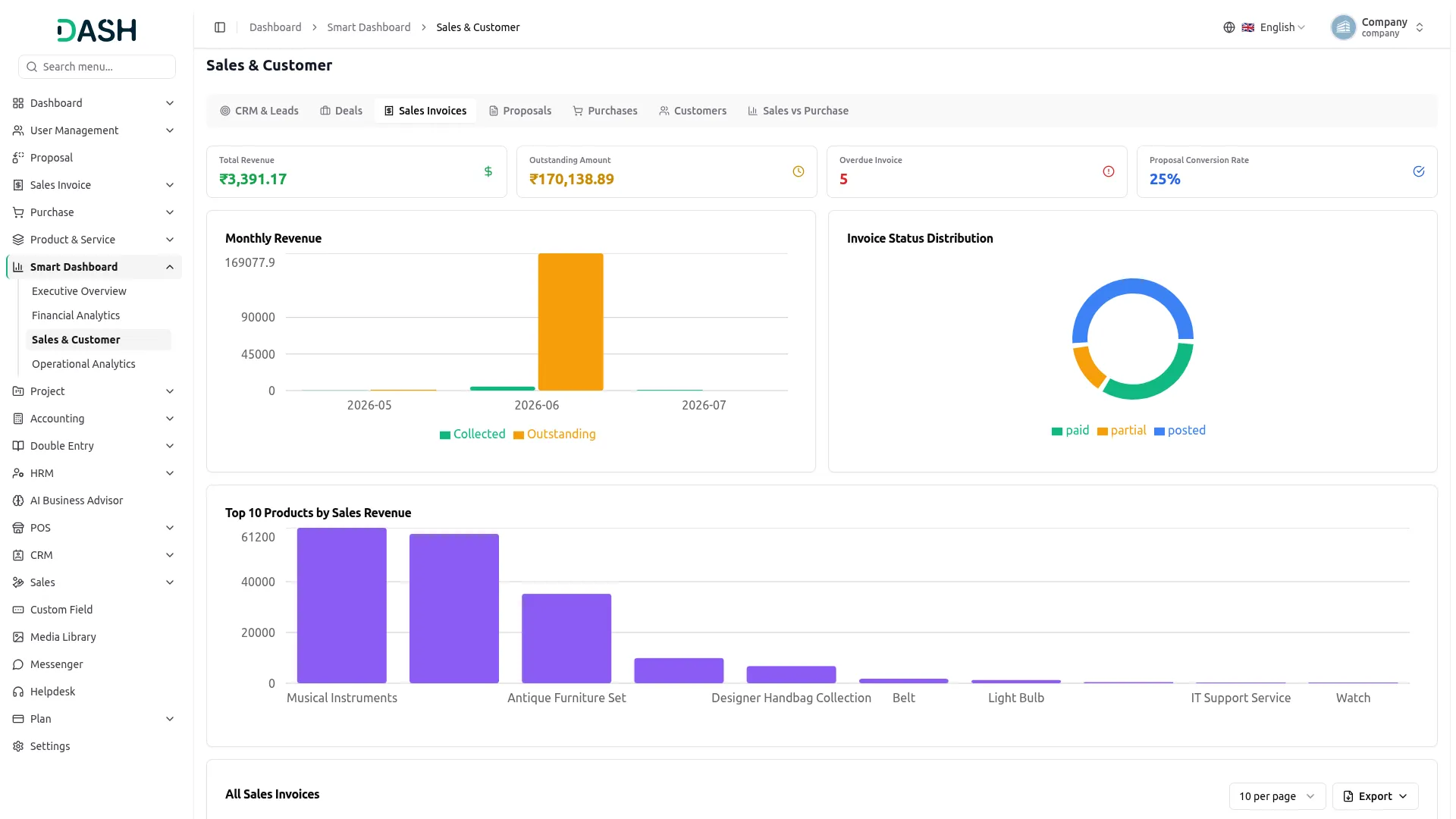
- Four summary cards at the top of the Sales Invoices tab show Total Revenue (the combined total of all sales invoices), Outstanding Amount (the total amount not yet collected), Overdue Invoice (the number of invoices past their due date), and Proposal Conversion Rate (the percentage of proposals that converted into invoices).
- The Monthly Revenue bar chart plots two series per month, Collected and Outstanding, showing not only how much was billed each month but also how much of it has been collected versus remains unpaid.
- The Invoice Status Distribution donut chart on the right breaks all invoices down by status: paid, partial, and posted. The proportions give you a quick picture of the overall health of your receivables.
- The Top 10 Products by Sales Revenue bar chart lists the ten highest-revenue products in descending order. Bar height reflects total revenue generated, making it easy to identify your best-performing products.
- The All Sales Invoices table below lists each invoice with its Invoice # (Click to show details page), Journal #, Date, Due Date, Customer, Type, Subtotal, Tax, Discount, Total, Paid amount, Balance, Status badge, and number of Returns. An Export button is available in the top right.
Proposals
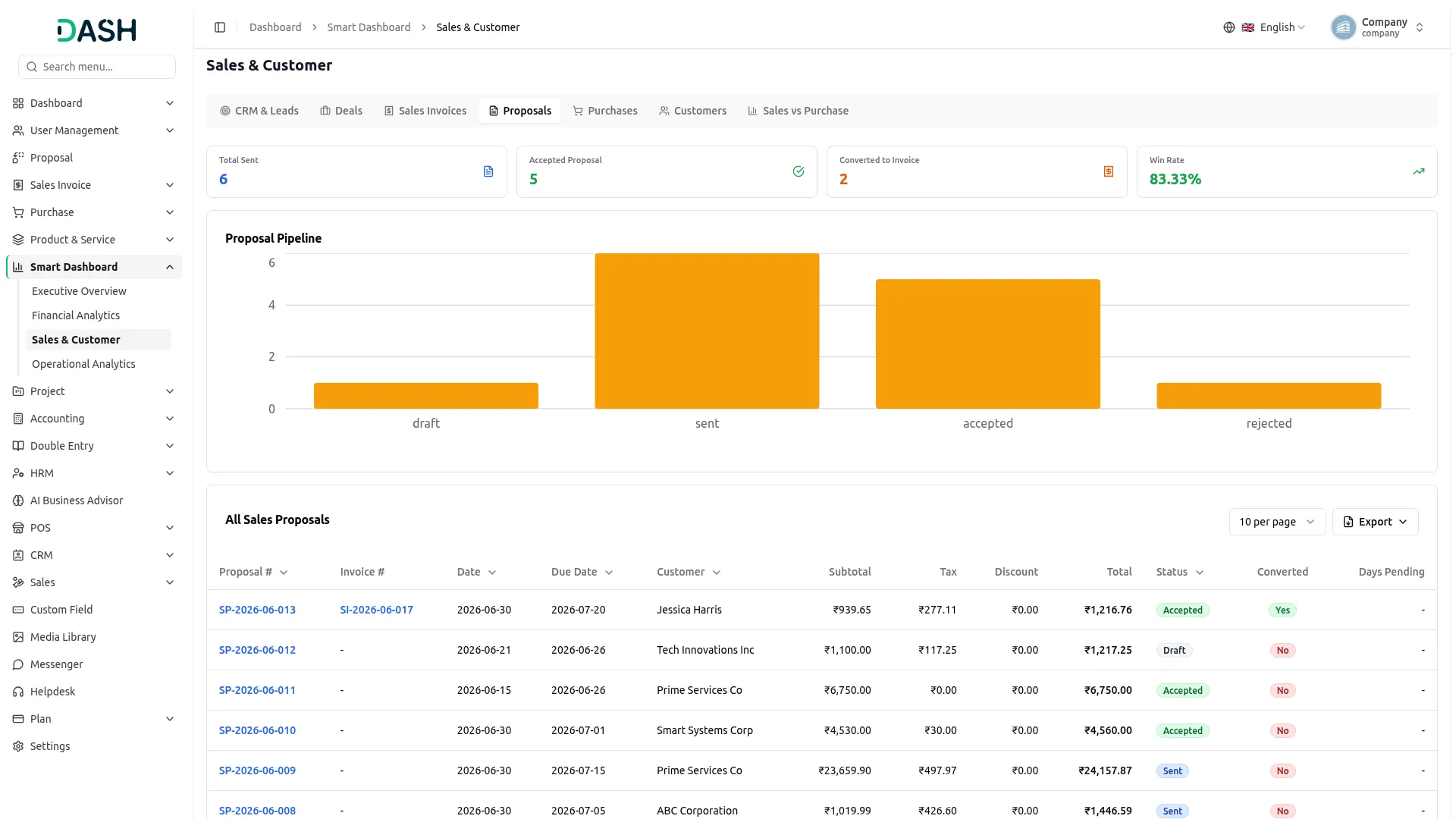
- Four summary cards at the top of the Proposals tab show Total Sent (total proposals issued for the period), Accepted Proposal (proposals accepted by customers), Converted to Invoice (proposals that progressed to an invoice), and Win Rate (the percentage of sent proposals that were accepted).
- The Proposal Pipeline chart shows proposals distributed by their current status. Below the chart, the All Sales Proposals table lists each proposal with its Proposal # (Click to show details page), Invoice # (if converted) (Click to show details page), Date, Due Date, Customer, Subtotal, Tax, Discount, Total, Status badge, whether it has been Converted, Days Pending, and Created By. An Export button is available in the top right.
Purchases
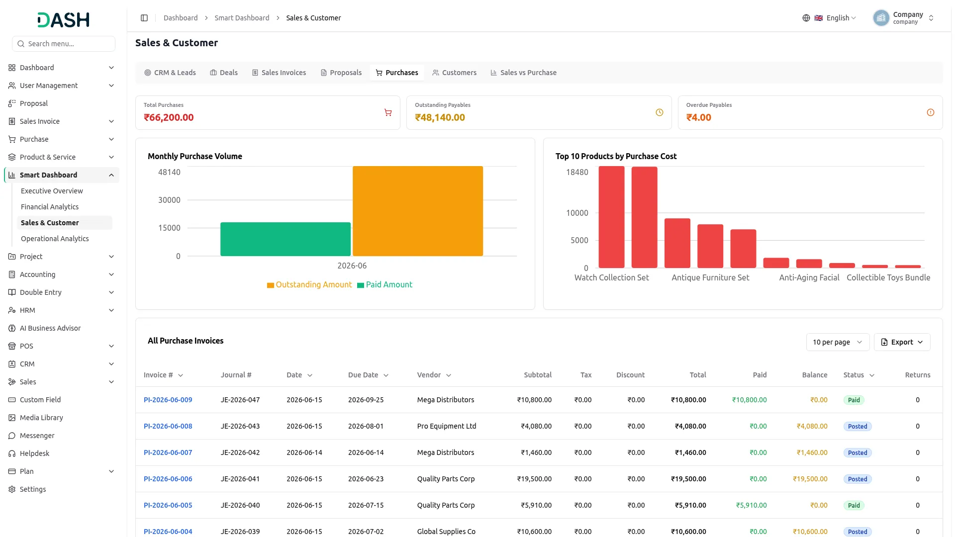
- Three summary cards at the top of the Purchases tab show Total Purchases (the total value of all purchase invoices for the period), Outstanding Payables (the total amount still owed to vendors), and Overdue Payables (the amount past its due date).
- The Monthly Purchase Volume bar chart plots two series per month, Outstanding Amount and Paid Amount, showing how much of each month’s purchasing has been paid off and how much remains outstanding to vendors.
- The Top 10 Products by Purchase Cost bar chart lists the ten highest-cost items by total purchase spend, helping you see where procurement outlays are most concentrated.
- The All Purchase Invoices table below lists each invoice with its Invoice # (Click to show details page), Journal #, Date, Due Date, Vendor, Subtotal, Tax, Discount, Total, Paid amount, Balance, Status badge, Returns count, and Created By. An Export button is available in the top right.
Customers
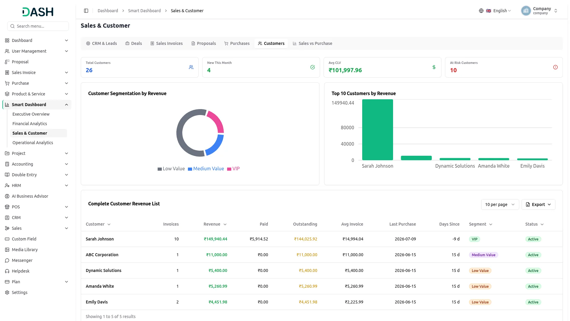
- Four summary cards at the top of the Customers tab show Total Customers (the number of active customers on record), New This Month (customers added during the current month), Avg CLV (the average customer lifetime value across your customer base), and At Risk Customers (customers who are inactive or showing a decline in purchasing activity).
- The Customer Segmentation by Revenue donut chart groups customers into three value tiers: Low Value, Medium Value, and VIP. The relative size of each segment reflects how many customers fall into each tier, giving you a visual breakdown of your customer base by revenue contribution.
- The Top 10 Customers by Revenue bar chart on the right ranks your ten highest-revenue customers side by side. Hovering over a bar shows the customer’s name and their total revenue figure.
- The Complete Customer Revenue List table below lists all customers with their Invoices count, Revenue, Paid amount, Outstanding balance, Avg Invoice value, Last Purchase date, Days Since last purchase, Segment badge (VIP, Medium Value, or Low Value), and Status badge. An Export button is available in the top right.
Sales vs Purchase
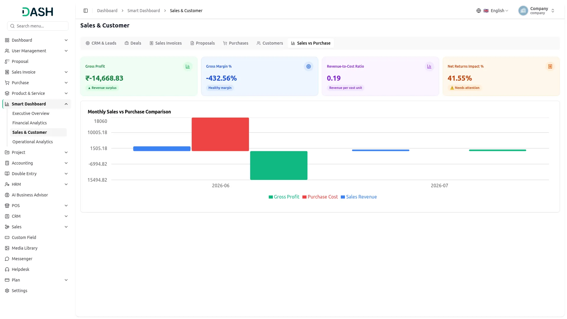
- Four summary cards at the top of the Sales vs Purchase tab show Gross Profit with a directional label (such as Revenue surplus), Gross Margin % with a health label (such as Healthy margin), Revenue-to-Cost Ratio expressed as a multiple with a Revenue per cost unit label, and Net Returns Impact % with an attention label when the returns figure requires review.
- The Monthly Sales vs Purchase Comparison chart plots three series as grouped bars per month: Gross Profit, Purchase Cost, and Sales Revenue. This lets you compare what you sold, what it cost to procure the goods sold, and the resulting gross profit side by side for each month.
Operational Analytics
The Operational Analytics section covers inventory, point-of-sale performance, project management, and vendor purchasing activity. Four tabs at the top of the page — Inventory & Stock, POS Analytics, Projects, and Purchase & Vendor, let you switch between views.
Inventory & Stock
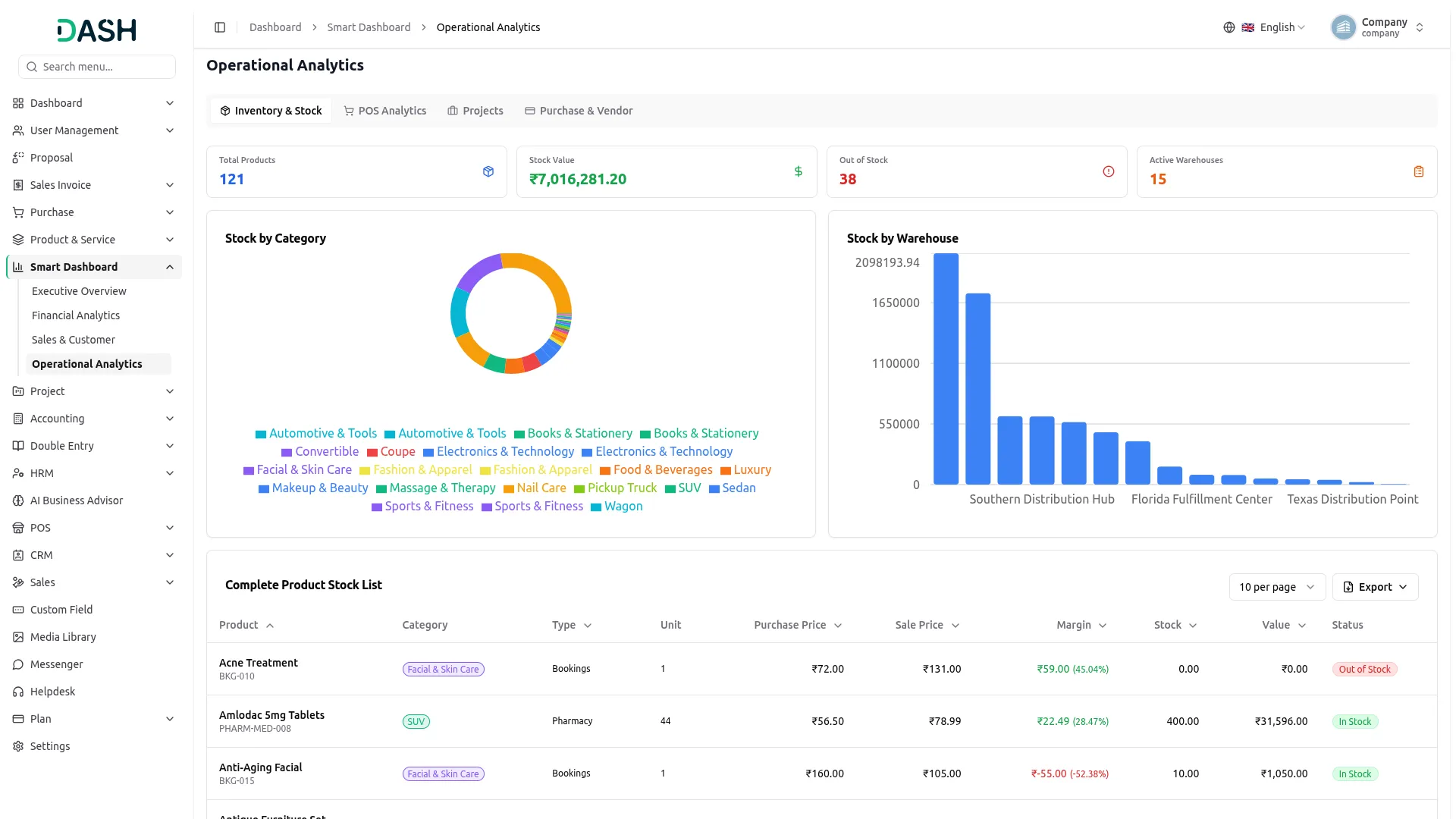
- Four summary cards at the top of the Inventory & Stock tab show Total Products (the total number of products in your catalog), Stock Value (the total monetary value of all inventory currently on hand), Out of Stock (the number of products with zero stock remaining), and Active Warehouses (the total number of warehouse locations in use).
- The Stock by Category donut chart shows how your inventory is distributed across product categories. Each segment represents one category, and a legend alongside the chart lists all categories present. This gives you a proportional view of where your stock is concentrated by product type.
- The Stock by Warehouse bar chart shows the total stock value held at each of your warehouse locations, with bar height representing the value stored there. Hovering over any bar shows the warehouse name and its exact Stock Value. This makes it easy to see which warehouses hold the most inventory.
- The Complete Product Stock List table below lists every product with its name and SKU code (displayed as a sub-label beneath the product name), Category (displayed as a colored badge), Type, Unit of measure, Purchase Price, Sale Price, Margin (shown as both a value and a percentage, highlighted green for positive margins and red for negative), Stock quantity on hand, total Value, and a Status badge indicating In Stock or Out of Stock. An Export button is available in the top right of the table.
POS Analytics
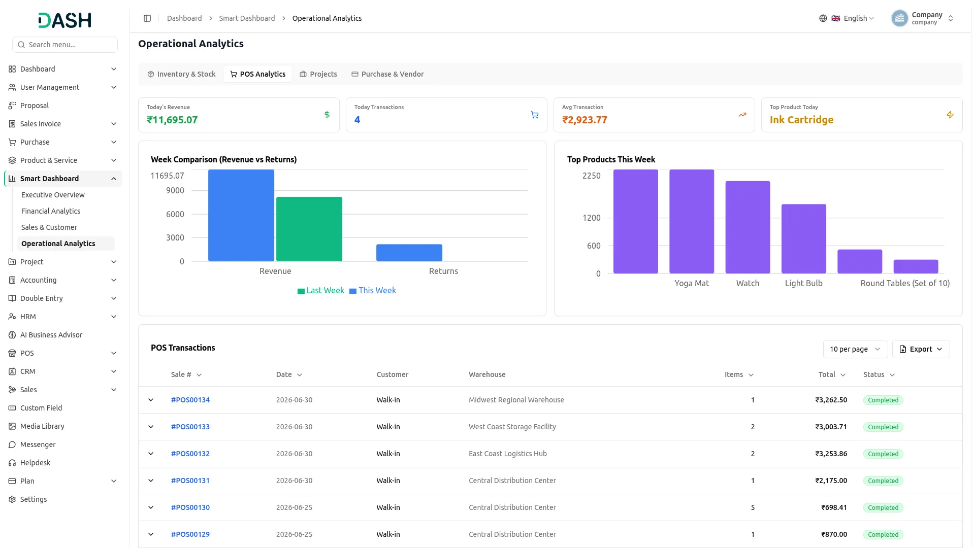
- Four summary cards at the top of the POS Analytics tab show Today’s Revenue (the total point-of-sale revenue recorded today), Today Transactions (the number of POS transactions completed today), Avg Transaction (the average value per transaction today), and Top Product Today (the name of the best-selling product by revenue for the current day).
- The Sales by Hour (Today) bar chart plots revenue broken down by the hour of the current day. Each bar represents one hour, and bar height reflects the revenue generated during that hour. This lets you see when during the day sales activity peaks.
- The Top Products This Week bar chart on the right ranks products by revenue generated during the current week, with bars listed from highest to lowest revenue.
- The POS Transactions table lists recent point-of-sale transactions with each record’s Sale # (Click to show details page), Date, Customer name (or Walk-in for anonymous transactions), Warehouse, number of Items, Total amount, and a Status badge (Completed). Pagination controls at the bottom of the table let you move through the full results set, and an Export button is available in the top right.
- The Top Selling Products table below the transaction list ranks your top-selling products with their SKU, Category, Units Sold, Revenue, Cost, Profit, and Margin %. Negative profit figures are highlighted in red. This table gives you a direct view of which products are contributing most to POS profitability.
Projects
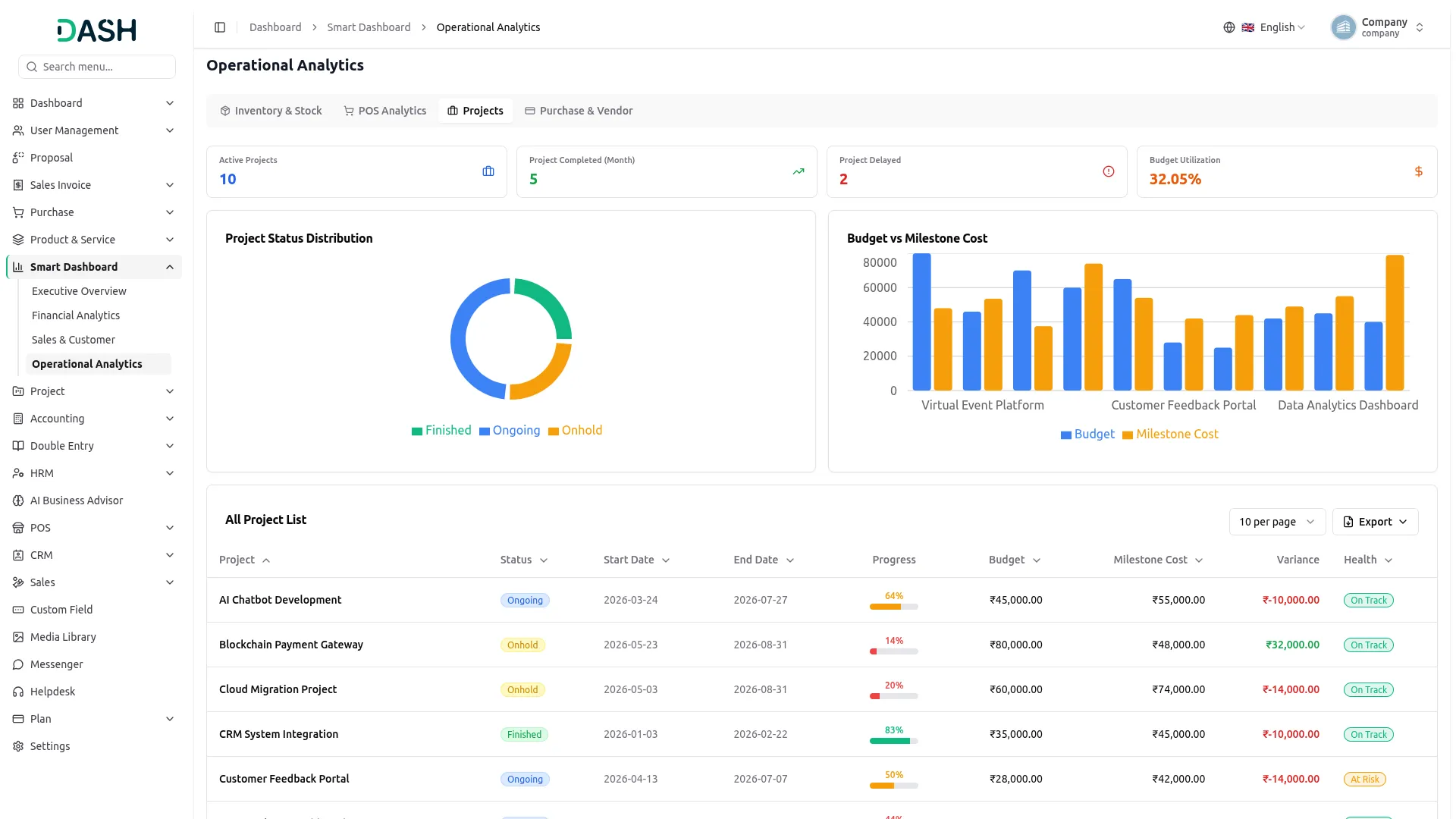
- Four summary cards at the top of the Projects tab show Active Projects (projects currently in progress), Project Completed (Month) (projects finished during the current month), Project Delayed (projects that have passed their planned end date without reaching completion), and Budget Utilization (the overall budget utilization percentage across all active projects).
- The Project Status Distribution donut chart shows how all projects are distributed across three statuses: Finished, Ongoing, and Onhold. The relative size of each segment reflects the count of projects in each state.
- The Budget vs Milestone Cost bar chart on the right compares the approved budget against the actual milestone cost for each project. Two bars per project — budget and milestone cost, let you see at a glance which projects are within budget and which have exceeded their approved spend.
- The Complete Project List table below lists each project with its Project name, Status badge (Ongoing, Finished, or Onhold), Start Date, End Date, a visual progress bar with a percentage figure, Budget, Milestone Cost, Variance (highlighted in red when the project is over budget), and a Health badge. An Export button is available in the top right of the table.
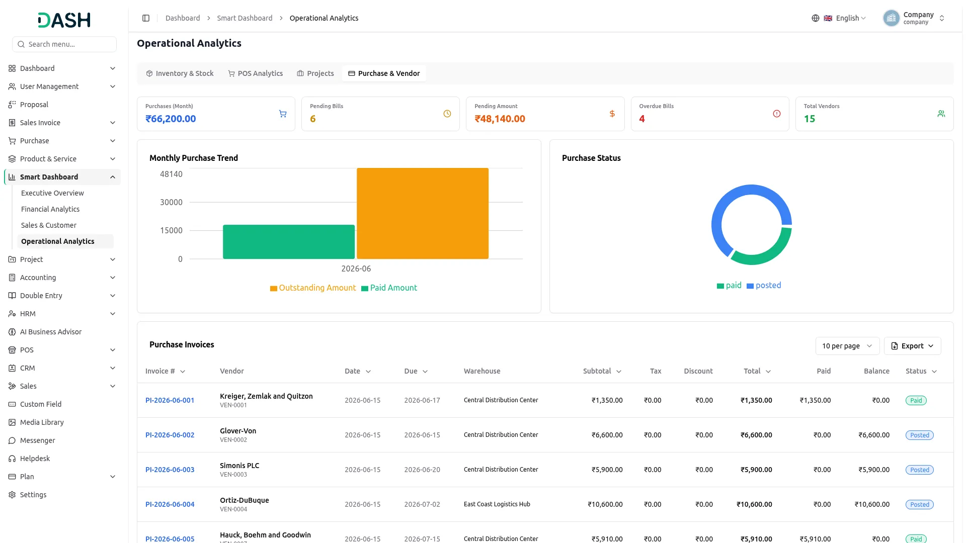
Purchase & Vendor
- Four summary cards at the top of the Purchase & Vendor tab show Total Purchases (the total value of purchases made this month), Pending Bills (vendor bills awaiting payment and the total amount owed), Pending Amount (the total monetary value still owed across those pending bills), Overdue Bills (the number of bills that have passed their due date), and Total Vendors (the total number of unique vendor accounts on record).
- The Monthly Purchase Trend chart plots procurement volume across recent months, letting you see whether purchasing activity is increasing, decreasing, or holding steady over time.
- The Purchase Invoice Status Distribution chart shows the current breakdown of all purchase invoices by payment status, giving you a proportional view of what has been paid, what is pending, and what is overdue.
- The Purchase Invoices table lists every purchase invoice with its Invoice # (Click to show details page), Vendor, Date, Due date, Warehouse, Subtotal, Tax, Discount, Total, Paid amount, Balance, and a Status badge (Paid or Posted). An Export button in the top right lets you download the current list.
- The Vendor Purchase Summary table lists your highest-spend suppliers with their purchase history and payment information, so you can see at a glance which vendor relationships represent the largest procurement commitments.
- The Operational Expense breakdown shows expense totals grouped by spending category, giving you visibility into where operational costs are concentrated. Below it, the complete Operational Expense List provides a detailed record of individual expense transactions with status tracking. An Export button is available in the top right of both tables.
Categories
Related articles
- Diet & Nutrition Consultant – WorkDo Dash SaaS Add-On Guide
- Outlook Calendar – BookingGo SaaS Add-On Guide
- Roadmap Central – WorkDo Dash SaaS Add-On Guide
- Society Management – WorkDo Dash SaaS Add-On Guide
- Instamojo – BookingGo SaaS Add-On Guide
- WhatsApp Twilio – TicketGo Add-On Guide
- Google Authentication – WorkDo Dash SaaS Add-On Guide
- Square – BookingGo SaaS Add-On Guide
- Partial Payment – eCommerceGo SaaS Add-On Guide
- Export Conversations – TicketGo Add-On Guide
- FedaPay – WorkDo Dash SaaS Add-On Guide
- Easebuzz – WorkDo Dash SaaS Add-On Guide
We're Here to Help - Let's Talk
Have questions about our solutions, customization services, or business tools? Our team is here to help you. let's talk.